Project Casey Jones

Casey Jones Cover Sheet

Yesterday I was poking around eBay looking for things I just can’t live without when I stumbled on an auction that caught my eye. One of my canned eBay search criteria – ‘aerial mapping’ – triggered a hit for an auction for a US Air Force publication on something called Project Casey Jones. The subtitle was the real attention getter: ‘Post-Hostilities Aerial Mapping; Iceland, Europe, North Africa, June 1945 – December 1946′.  I was intrigued but the eBay seller was asking far (far) too much for the document. But since this was an official USAF publication I figured there was a good chance it was already available on-line in digital format. A quick Google search turned up a the document in PDF format on an on-line library and I grabbed a copy.

As I started to read the report it dawned on me that I never really knew where the base mapping imagery came from that allowed the Army Map Service to re-map all of western Europe and North Africa quickly and accurately right after the close of WWII. I just assumed the aerial photo missions were done on a piecemeal as-needed basis by US assets or we collaborated with host countries like France or Italy to obtain civilian aerial photo coverage.

As it turns out the collection of aerial mapping imagery at the close of WWII was a far more centralized and directed effort than I could have imagined. The fact that the project was carried out so quickly, comprehensively and effectively is remarkable and is one of the great untold stories in the US Army’s topographic history.

In 1944 it was clear to senior Allied leadership that Germany’s days were numbered and thinking started to turn to projects that would help secure the US position in post-war Europe. A huge issue that had emerged from both the ground and air campaigns in Europe was the lack of accurate and up-to-date maps and air charts. During the war the Allies’ mapping services, like the US Army Map Service, scrambled to meet the demand for large and medium scale maps. They often relied on outdated local maps of dubious accuracy, supplemented where possible by photo mosaics or photomaps based on aerial photography taken by reconnaissance aircraft. The science of mapping using stereo aerial mapping photography was well understood at the time, and the US Army Air Force (USAAF) had the necessary cameras and aircraft at their disposal, but flying long, slow and precise flight lines over enemy held territory was out of the question while both sides were still shooting at each other.

Allied military leadership realized that once the shooting stopped there would be a very short window of opportunity during which they would be able to fly photomapping coverage of most of western Europe. The idea was to get the job done while the American’s still had the political clout and the resources in Europe. The US Government and the USAAF applied a carrot and stick approach to the problem. In concert with the British Royal Air Force, the USAAF would fly the conquered territories (Germany, Austria, Italy, etc.)  at will (“we won, you lost, tough luck”), and the Allied, newly liberated or neutral nations (France, Spain, Switzerland, Netherlands, Belgium, etc.) would be offered a copy of all aerial imagery collected over their territories (“we’re your friends and we’re just helping you get back on your feet”). In the end it worked, and over two million square miles of new stereo aerial imagery was collected in about 18 months.

Casey Jones Airfields

The Project Casey Jones report brings to light some very interesting historical tidbits. The first were the technical issues. How do you keep a big, heavy bomber like a B-17 on a straight, steady course for hundreds of miles? The answer turned out to be ingenious. After the pilots failed multiple early attempts to keep the aircraft flying straight and level the job was turned over to the bombadiers and their Norden bomb sights. Since the Norden bomb sight effectively took control of the aircraft once the bombing run to the release point was initiated – controlling aircraft attitude, direction of flight and compensating for wind drift and other factors – it became a relatively simple matter to re-program the sight so that visual check points along the photographic flight line became the ‘release points’, and the bombardier actually controlled the flight by flying from check point to check point along the flightline path using the Norden. Simple but effective.

norden-bombsight

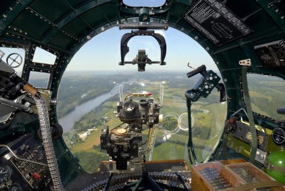
Norden bomb sight in the nose of a B-17. From this station the bombardier took control of the aircraft and flew from check point to check point along the flightline. Many of the flightlines were 200 or more miles long

The other interesting factor was quality control. The USAAF was flying to meet US Army Corps of Engineer (Army Map Service) requirements and had to adhere to mapping imagery standards for image overlap, side lap, aircraft attitude, cloud cover, haze and other factors. In the beginning the rejection rate of aerial imagery was unacceptably high – some flight crews only hitting the mark 20% of the time. Part of the problem was a lack of familiarity with the mission, part was mechanical problems with the installation of the mapping camera systems, and part was weather and atmospheric conditions. To help solve the problems and improve the success rate for the photo missions the Corps of Engineers put photomapping officers and technicians in each of the squadrons. These personnel would grab the film as soon as the aircraft landed, develop it and quickly review it while the flight crews were still in the area. They could do a quick post mortem on the success or failure of the flight and provide the crews with valuable feedback on what was needed on upcoming missions. As air crew experience increased the success rate increased, and towards the end of 1946 the success rates for each mission hovered around 60%.

Other factors worked against the project; weather during one of the worst winters in modern memory (1945 – 46), high personnel turn-over rates caused by rapid demobilization and political issues that delayed or canceled overflight permission. But in the end the USAAF was successful, and Project Casey Jones was effectively complete by September 1946.

So what became of the two million square miles of mapping photography flown during Project Casey Jones? It was immediately transferred to the the Army Map Service and was used as a primary cartographic data source for at least the next 20 years. It was used in the wide-scale production of up-to-date tactical and operational scale maps of western Europe by American and British military mapping agencies, maps that supported the operational backbone of NATO well into the 1960’s and perhaps beyond.

Brian

Ted Abrams

Yesterday the December issue of American Surveyor magazine appeared in my mailbox. American Surveyor is one of the few trade publications I read from cover-to-cover every month, and it’s one of the very few I’d gladly pay a subscription fee for. But since the publisher, Cheves Media, provides it free of charge all the better.

American Surveyor DecCover2015full

This month’s issue hits it out of the ballpark. The cover is one heck of a teaser – a beautiful shot of the John Bird transit telescope used by surveyors Charles Mason and Jeremiah Dixon to establish the boundary between Pennsylvania and Maryland just before the Revolutionary War. This is the famous ‘Mason – Dixon line’ that today is viewed (incorrectly) as the cultural and political dividing line between the American North and South. Mason & Dixon’s achievement is an important topic in the history of topography in the Americas and we’ll have more on it in a later post.

Today however we’ll focus on the other key article in the magazine – a short overview of the achievements of Ted (Talbert) Abrams, an early pioneer in the science of photomapping and and photogrammetry. Abrams was one of the quiet heroes of topographic history, someone most have never heard about but who’s accomplishments revolutionized science, established an industry and helped found the geospatial profession many of us practice in today.

Ted Abrams

Just what were Ted Abrams’ achievements? He effectively invented the business of photomapping. It was his experience as a US Marine Corps reconnaissance pilot during WWI that convinced him that aerial photography could be used to make highly accurate maps. At the time traditional mapping technology required the use of ground survey and field verification crews to literally walk and survey the areas to be mapped, usually using laborious plane table survey methods. The process was slow and expensive. One of the earliest uses of aircraft during WWI was to take vertical photos of battlefields for the creation of map substitutes. These were simple photo mosaics annotated with things like road and town names, but they filled a critical need.

Coming out of the war Abrams was convinced that photomapping could not just be a viable business, but could revolutionize the science of large scale mapping over broad areas. Ted Abrams was part pilot, part scientist and part entrepreneur, and all genius. Where no industry existed, he developed the techniques and the instruments necessary to capture and process tightly controlled areal mapping photography and compile accurate maps from that data. He then developed the business model that made it all profitable. He also helped develop a lot of the science behind the processes involved in photomapping. You can’t claim your maps and photo mosaics are accurate unless you can prove the mathematics and geometry that went in to making them, and Abrams was an early pioneer in developing the mathematical principles behind processes like aerotriangulation.


Ted Abrams was also a life-long patriot and a proud Leatherneck. During WWII he set up schools that trained thousands of Marine Corps photo mapping and photo analysis specialists, and his techniques and textbooks were in wide use across all the military services. One of his simplest yet greatest accomplishments was the invention of  the folding pocket stereoscope. This stereoscope was manufactured by the hundreds of thousands by the Abrams Instrument Corporation and other manufacturers and became the indispensable tool of photo interpreters, surveyors, cartographers and intelligence analysts around the world.

Frost Course Module 3 blow-up

Invented by Ted Abrams in 1942, the simple folding pocket stereoscope has been the indispensable tool of topographers for over 70 years. They are still in wide use today

After the war Abrams’ business flourished as America went on a building boom. He built Abrams Aerial Survey into the leading aerial survey firm in the United States and the Abrams Instrument Corporation became a leading supplier of aerial photography, photogrammetry and aerial photo analysis instruments.

Ted Abrams was a founding member of the American Society of Photogrammetry (now the American Society of Photogrammetry and Remote Sensing (ASPRS)) and much of his pioneering work made its way into the first editions of the industry’s standard reference, the Manual of Photogrammetry.

Manual of Photogrammetry

In recognition of Abrams’ contributions the ASPRS presents the Talbert Abrams Award every year to ‘encourage the authorship and recording of current, historical, engineering, and scientific developments in photogrammetry.’

One last example of Ted Abrams’ genius. He came out of WWI with a clear understanding of the limitations of current aircraft designs when used as platforms for aerial cameras. Abrams knew he needed a more stable aerial survey platform designed around the needs of the camera system and crew. In the 1930’s Abrams sat down and designed what became the world’s first dedicated aerial imagery platform – the Abrams P-1 Explorer.

Abrams_P-1_Explorer

First flown in 1938, it was specifically designed for the mission of acquiring aerial mapping photography. The P-1 incorporated a number of unique design elements, including a pusher-type engine arrangement designed to keep leaking oil and fluids from smearing the camera lenses (a serious problem with conventionally laid out aircraft using rotary engines), and it was one of the earliest aircraft to utilize Plexiglas for windows. In fact the nose layout made its way into WWII military aircraft designs, particularly the nose arrangement of the early B-24 Liberators.

Unfortunately the P-1 design was a victim of war. By the time the aircraft became operational proved itself as an outstanding aerial camera platform WWII had broken out. The US Army Air Corps looked at the design and deemed it too slow and too vulnerable to enemy fire. Ted Abrams realized he needed to work on ways to mount mapping camera systems in fast moving fighters and modified bomber aircraft and threw himself into the task without looking back. Only one model of the P-1 was ever built and it remained in operation in the US until 1948.


A fascinating aircraft designed by a true genius and pioneer in our industry. We truly do stand on the shoulders of giants.

Brian

US National Grid – An Update

It’s been a while since we’ve discussed the US National Grid, but I was recently brought back to the topic.

Last week at work I got involved in a debate with some of our emergency response managers and operators on the issue of map grids. We are putting together a comprehensive emergency operations dashboard (web map) and I thought it would be useful to have a standard grid available that all agencies can use, understand and reference their response efforts against.

My first reaction was to just go ahead and use the US National Grid (USNG). It is easy for us to create web and paper maps that display the grid, it is easy to understand and its use is mandated by federal policy (or so I thought). I was quickly shot down. Someone in the ops group produced a PDF of a map displaying an arbitrary alphanumeric grid. This grid was generated a half decade ago by someone who is long gone and nobody knows where the CAD file is that holds the original grid drawing. Yet this grid has been ‘approved’ by a large federal agency with wide ranging authority and so it was deemed the grid for emergency responders to use. It didn’t seem to bother too many folks that the only place the grid existed was on this small scale PDF. No way to update the underlying map or photo, no way to bring this map into other products. It didn’t matter – this was the approved grid, period.

What really got my attention was when one of our emergency services coordinators, a good guy who’s had (by his estimate) hundreds of hours of federally mandated (and developed) training on disaster response, told me that in all his training classes he’d never even heard of the USNG.

Your tax dollars at work.

In the end we gave up and one of our sharp geospatial analysts was able to recreate the grid as a georeferenced polygon layer using the Data Driven Pages functionality in ArcGIS. So now this approved grid exists not as an overlay on a static paper product, but as a scalable data layer that can be easily incorporated into paper or web based map.

But still, USNG soldiers on. I snuck it in as a data layer in this operations dashboard. It’s turned off by default, but it’s there if needed. I guess everybody’s happy. The ops guys get their arbitrary grid that has no real relation to any recognized spatial coordinate system, but hell, it’s approved! I get a grid that may (or may not) be approved and mandated by the Feds, that every emergency responder gets schooled on when he/she goes for federally mandated training (or maybe not), and is supposed to be the standard emergency response grid system in use by the federal government (perhaps).

Again, your tax dollars at work.

In working through this issue and trying to find documentation and guidance on the mandated uses of USNG I happened on this interesting site, the US National Grid Information Center:

USNG Information Center

This site holds a lot of great information on the USNG and its applications, and I encourage everyone who deals with USNG or MGRS to spend some time going through the resources.

Even more interesting, it appears the site is not maintained or supported by any federal agency or the FGDC (the ‘father’ of the USNG concept). This is all a private effort and the site is supported by the SharedGeo organization.

So here’s an example of your tax dollars not at work, and it’s a good thing!

Brian

I’m Always Going Somewhere

Time for a book review. In fact, this review is long overdue. I’ve mentioned before in this blog that the history of the Inter-American Geodetic Survey (IAGS) is poorly documented. As far as I know its parent agency, the US Army Corps of Engineers, has never published a comprehensive general history of the organization and its achievements. But then, the modern Corps of Engineers has never been particularly interested in celebrating its topographic history and lineage (yes, that’s a dig).

Earlier this year I was contacted by an IAGS alum, Paul Hauser, who was putting together a book on his personal experiences while working as a geodesist for the IAGS from 1968 to 1970. He was incorporating experiences from other IAGS alumni and contacted me for permission to use some of the material I’ve posted on this blog and website.

A few months ago Paul’s book was published and he graciously provided me a copy to read and review. The book, titled I’m Always Going Somewhere, is less a history of the IAGS than a collection of personal experiences that detail what it was like to work as part of the field parties that the IAGS deployed all across Central and South America. But in these stories you get a real sense of how the IAGS accomplished its mapping and surveying missions in some of the most remote (and dangerous) areas of the world and in an era before GPS, high resolution satellite imagery, smartphones, tablets, laptop computers and GIS software.

I'm Always Going Somewhere

Paul and his contributors Roald Bendixen and Carol Ann Skillern have put together a remarkable and important collection of their personal experiences while working in the IAGS. If you have any interest in the IAGS or the history of mapping and surveying I strongly encourage you to get a copy of this book.

My hope is that this book will encourage other IAGS alumni and the family members of alumni to come forward with their stories so we can start to build a more complete history of this fine agency.

I’m Always Going Somewhere is available from Amazon in both print and Kindle editions

Brian

The Brunton Cadet

This website has covered the Brunton pocket transit and its clones in-depth, but there’s one design that shares some of the classic pocket transit DNA that we haven’t looked at yet – the Brunton Cadet pocket transit.

Brunton Cadet

I’m not sure when the Cadet was introduced, but I’m guessing they hit the market in the late 1950’s or early 1960’s. The next question is, why? The cadet offers about 50% of the functionality of the classic pocket transit design (it lacks a needle dampening system, leveling bubbles, extended sighting vanes and an adjustable clinometer) and comes in at less than 1/4 the price of a base model Brunton pocket transit. My guess is that Ainsworth (the original manufacturer of both the Brunton pocket transit and the Cadet) was getting a lot of requests for a compass that had most of the features earth science students needed to get the job done, but at a much lower cost as compared to the classic pocket transit.

To answer the demand Ainsworth produced an all-plastic compass that is the same basic size and shape of the classic pocket transit but is greatly simplified. My example was produced sometime in the 1960’s, judging by the marking on the box. It offers a sighting mirror, clinometer and a compass ring set off in both degrees and quadrants (a neat idea that could have been migrated over to the standard pocket transit but, alas, never made it there). On my example the sighting mirror is a heavy piece of mirrored glass with a sighting line scored down the center and (I’m assuming) glued to the compass lid. The undampened needle has no obvious north markings on it save for a small hole punched in the needle to indicate the north end. The clinometer is a simple free swinging indicator affair set off in degrees of slope, but not percent.

Ainsworth claimed this is a ‘training’ compass, intended to teach students how to use the full featured pocket transit. Printing on the side of the box even states that the Cadet affords “… all the applications of the Brunton Pocket Transit, Basic Mapping Procedures, Plotting, Dip & Strike, Clinometer, Alidade, Prismatic Compass”Boy that’s a load of bull! Without bubble levels it is impossible to do accurate strike and dip measurements on rock formations, so the Cadet’s usefulness for geology field work is limited. Without the sighting vanes it is impossible to use it as an alidade. With an undampened needle it’s extremely difficult to use it as a plotting tool or to accurately set a bearing. And it’s not a prismatic compass, it’s a mirror compass. Clearly the advertising guys at Ainsworth never took these things to the field before writing the copy. What the Cadet does remind me of is an old forester’s compass, but with a few added features. Perhaps it was designed to steal market share from the Silva Ranger compass, which was gaining in popularity in the US in the post-war period among foresters and others who needed to do rough field work with a map and compass.

Brunton Comparison 2Ainsworth Brunton pocket transit and the Ainsworth Cadet. Both were manufactured around the same time period

But the Cadet design (or price) must have resonated with many college and university earth science departments because I remember seeing them in the pile of pocket transits available in the geology department when I was attending school. I never used one – as a poor geology student I relied on my Silva Ranger for map and compass work and if I needed to do strike and dip measurements I just borrowed someone’s pocket transit.

Brunton Cadet Manual Front

Brunton Cadet owners manual (click to open)

Which leads, I guess, to the point of this post. The Brunton Cadet is interesting if you like to study the lineage of pocket transits, but it really doesn’t work all that well in today’s world. If you need a pocket transit just suck it up and buy a full featured model. The Cadet is still produced by Brunton and right now is sells for a little over $40 on Amazon. It’s a big step up in price to the cheapest full featured pocket transit, the Brunton ComPro (at just under $250 on Amazon), but the ComPro is a professional instrument and well worth the investment. If you just need a sighting compass there’s any number of mirrored sighting compasses available close to the Cadet’s price point that do a much better job. My personal recommendation is the Suunto MC-2.

We’ll just call the Cadet an evolutionary dead end on the pocket transit tree of genetic diversity. An interesting item for study, but one pushed out of the ecosystem by more evolved competitors.

Brian

Mapping The History Of The ATL

Candler Field Post Card 2

Over the years in this blog I’ve obliquely referred to where I work as “the world’s busiest airport”. Most of my friends know that I’m referring to Hartsfield-Jackson Atlanta International Airport (H-JAIA) in Atlanta. The city of Atlanta is often referred to as “the ATL” but the term ‘ATL’ is actually the International Air Transport Association code that identifies H-JAIA in airline ticketing, reservation and baggage handling systems. When your flight destination is Atlanta the ticketing agent slaps a big ATL tag on your luggage to let the baggage handlers know where it needs to go. The younger generation in Atlanta has latched onto the term “the ATL” to describe their city, and I think it’s an interesting way of acknowledging the part the airport has played in the growth of the Atlanta region over the past 30 years.

A lot of folks get confused when they think of H-JAIA. Some think it’s the world’s largest airport. It’s not – far from it. Lots of other airports occupy more ground. H-JAIA’s claim to fame is that for the past decade or so it has been the world’s busiest civilian passenger airport. As of this date H-JAIA is serving over 250,000 traveling passengers per dayThat’s more passengers per day than many airports handle in a week, a month, or even a year!

But how did H-JAIA get to where it is today? You don’t just build an airport and a quarter million passengers magically appear. The story of Atlanta’s airport is the story of concerted efforts on the part of a succession of mayors, starting with William B. Hartsfield and extending right up to today’s mayor, Kasim Reed, to build, promote and maintain the city’s airport as an engine of economic growth for the Atlanta region and the entire southeastern United States. But growth means construction and expansion, and that’s why we are here today.


One of my jobs at H-JAIA is managing the airport’s aerial imagery program. In fact, before my team came on-board in 2007 there was no formal aerial imagery program. Aerial coverage of the airport was occasionally flow by government agencies like the US Geological Survey or the Soil Conservation Service, and in later years by contractors working large projects at the airport, but there was no Atlanta airport-managed and funded effort to acquire standard aerial imagery for use in the airport’s CAD and GIS systems. The engineering and design staff at the airport just relied on hand-me-downs and took whatever imagery they could get.

Once we got the aerial imagery program in place (we now have the airport flown once a year for orthorectified coverage at high and medium resolutions) staff at the airport started asking if it would be possible to ‘register’ successive years of imagery in an effort to track the changes that have taken place at H-JAIA. I was intrigued by the request. We had a small but growing catalog of aerial images and I thought it would be fun to take on the challenge.

A persistent rumor among many of the long-time employees in the airport’s planning & development division was that the airport got its start years ago as a racetrack. Now, nobody could define what ‘years ago’ meant. Some said maybe 50 years ago, others said 75. They just knew it was a long time ago, before they started work at the airport. In addition nobody could tell me precisely where this racetrack had been located. They only knew it had to be somewhere on the north side of the airport property since the airport’s growth over the decades was a steady march from north to south. Sadly, decades of airport expansion had obliterated all traces of it.

Some folks offered up old postcards and oblique aerial photos that depicted the race track. Clearly it had once existed, but where?

Atlanta Speedway postcard

An early postcard showing the speedway. The problem is, the artist got a lot wrong. The stands and supporting buildings were never as grand or extensive as shown in this drawing, and the layout is actually the reverse of what was actually built. My guess is this is a copy of a conceptual drawing or plan that got turned into a postcard

Atlanta Speedway oblique_orig

Oblique aerial photograph of the Atlanta Speedway race track taken around 1919 and looking to the northeast. OK, there clearly had been a racetrack, but where was it in relation to the modern airport?

Even the Civil Aeronautics Authority (forerunner to the FAA) got into the act and published an early airport data sheet that clearly shows the remnants of the racetrack with the new post-war pattern of runways and taxiways overlaid on it

Atlanta Airport Data Sheet circa 1940

1946 Atlanta Municipal Airport data sheet

By this time I was getting a good bit of help. Several co-workers – Bill Beckwith, Dottie Gandee and Talley Jones – all aviation history buffs, started digging through their resources and finding interesting tidbits. One day Talley came to me with an aerial photograph of the airport taken in 1940 by the US Soil Conservation Service. It was an ‘ah-ha!’ moment. There in the upper center of the photo was the clear outline of remnants of the racetrack along with the early runways and taxiways. But just as important, the photo also showed street intersections in the surrounding communities of College Park and Hapeville. These street intersections would prove critical to ‘registering’ or georeferencing this aerial to more recent airport images.

Candler Field 1940

Atlanta’s airport, 1940. At the time it was known as Candler Field. The image is rotated just a bit as a result of the georeferencing process and is oriented to true north

Soon more aerial photos came my way. In particular the 1949 aerial shows the growth of the airport spurred by the rapid expansion of civil aviation after WWII and Atlanta’s early moves to establish itself as the major hub airport in the southeast.

Atlanta Municipal Airport 1949

Atlanta Municipal Airport, 1949

I found myself with great aerial images separated by a wide gulf of time and change. I had our modern, highly accurate orthorectified aerial images tightly tied to the Earth’s surface and old, historically significant aerials with no ties to anything. It was time to get to work and georeference the old to the new.

The process of georeferencing is easy to understand. You have two images, one of which is already georeferenced, or ‘tied’, to the Earth’s surface. Using common tie points – things like road intersections or key natural features seen in both images – you use the controlled (georeferenced) image to bring geographic values (x & y) onto the same points in the uncontrolled image. When the process is complete the uncontrolled image is now georeferenced and will automatically line up with any other georeferenced image or map.

An accurate georeference process requires the use of several common tie points evenly distributed around the images. For example, if all of your common points are clustered in the upper left of your images then the accuracy of the georeferencing process will rapidly fall off as you move towards the lower right of the uncontrolled image. This is precisely the issue I ran up against when trying to georeference the older 1940 and 1949 aerials to our modern orthorectified images. As the airport grew to the south it wiped away all traces of the old road patterns seen in the southern portions of the old photos. While there were road intersections in the upper parts of the old aerials that were still visible in the current images that made good tie points, there were no common points available as we moved south, away from the Hapeville and College Park areas. Atlanta’s airport had literally bulldozed away entire communities, farms and roads as it expanded southward. Where there were road intersections, houses, churches, farm fields and fencelines in the 1940 and 1949 aerials there was nothing but runways and taxiways in the modern images. I was stuck.

1940 vs 2013 comparison

Here was the problem. As part of airport expansion projects over the decades Atlanta’s airport bulldozed away most of the common reference points like road intersections that would have allowed accurately georeferencing the historic images to modern imagery. (Click to enlarge)

Then one day I was looking through the US Geological Survey’s (USGS) on-line historical topographic map library and found the 1955 1:24,000 scale topographic quad sheet for East Point, GA. These historical topo sheets are high quality scans of the original paper maps and have been georeferenced. As I looked at the 1955 quad sheet and the 1940 & 1949 aerials I realized I had found my Rosetta Stone. The 1955 topographic map and the aerials all shared evenly distributed tie points and I could use the map to accurately georeference the images. While this 1:24,000 scale topographic map is not a highly accurate control source, it was more than good enough for this job.

Atlanta Airport topo 1955

The Rosetta Stone! Portion of the 1955 edition of the USGS East Point, GA topographic quad sheet. Using this map I was able to accurately georeference a series of aerial images extending from 1940 to 1972

Here’s a graphic that shows how the georeferencing process works. The process is handled by our ArcGIS desktop software which offers powerful tools to georeference a wide variety of maps, images, charts, CAD drawings or any other data that can be tied to a ground location.

Georeferencing Example

How georeferencing works. The concept is as old as map making itself, but modern GIS software makes it fast, easy and accurate


So let’s get back to the original question – where was this racetrack? Well, now that we had the 1940 aerial georeferenced it was a simple matter of tracing the racetrack from the aerial and creating a new GIS data layer that could be used in a wide variety of maps. Mystery solved!

Atlanta Speedway 1940

Alignment of the Atlanta Speedway, 1940. Remnants of the speedway are still visible in the image, permitting accurate tracing of the alignment

Atlanta Speedway 2014

Alignment of the Atlanta Speedway against the 2014 aerial

But what to do with all this great information? It’s a shame to keep all this airport history locked up on a hard drive. Just a few years ago if someone wanted to view our historical imagery we were limited to printing paper maps or relying on emerging and not-yet-mature web mapping technologies to put this information out on the Internet. But times have changed, and with modern image caching technology and cloud-based web mapping platforms we can share this web map to the world. So click the web map icon below and explore the history of Hartsifield-Jackson Atlanta International Airport as told through aerial photography and maps. The available map layers start with a 1936 airport development plan drawn up by the Works Progress Administration and carry through to our 2014 aerial basemap.

Historic Airport Viewer

Click to open the web map

The web map was built using ESRI’s Web App Builder technology and all data is hosted via the airport’s ArcGIS Online website. If you have any questions or comments please feel free to add them to the comments list below.


This post is about the history of the airport as told through aerial photography. For a more in-depth look at Atlanta’s extensive aviation history I invite you to visit David P. Henderson’s excellent Sunshine Skies website.

Sunshine Skies

Brian

The National Geographic Society Is In Trouble

Reports came out this week that the National Geographic Society (NGS) is in serious financial trouble and has sold controlling percentages of its magazine and film production business units to the Murdoch enterprise.

NatGeo

Yes the NGS is in trouble, but not because Rupert Murdoch now has majority ownership of the Society’s flagship magazine. No, the NGS is in trouble (and has been for years) because its directors and editors have allowed a once world class general interest science, geography and exploration magazine to devolve into just another ‘me too’ hack global warming/ivory poaching/rain forest shrinking/sea level rising/save the whales rag.

I used to be an avid reader of the NGS magazine. This is the scientific society that probed all corners of the world, went to the North Pole with Peary, to the depths of the oceans with Cousteau, to the top of Everest with Whittaker, to the Olduvai Gorge with Leakey, to the Gombe with Goodall, supplied presidents and generals with maps of battlefields when no others existed, educated a homefront on what world war really meant, and helped generations of budding young explorers, adventurers and dreamers (like me) visualize a world far beyond the limits of their small towns and villages.

My wife and I subscribed to the monthly magazine for over two decades and they usually got read cover-to-cover. Our kids eagerly devoured the children’s magazines and hardback books. The Society’s TV specials were infrequent but always produced to the highest standards and well worth letting the kids stay up and watch. And their maps – oh, their maps! Some of the most glorious examples of cartography ever put to paper. We collected and carefully cataloged all the magazines, and I began a serious search to fill out the collection with pre-1950 editions. Somewhere along the way it dawned on me that the modern magazine editions (mostly post-1990) are just not worth keeping around. They simply lacked the substance that was found in the earlier editions. So out the door they went to the rummage sale. Today the only editions I keep are those from WWII and earlier.

It seems the NGS tried to put revenue ahead of quality. They decided that a superficial pass at every environmental issue du jour would sell more magazines than serious inquiry and quality coverage. Political correctness replaced intellectual rigor and inquisitiveness. When every other magazine on the rack is covering and saying the same things it’s hard to stand out from the competition, particularly when the competition also provides updates on the latest Kardashian wardrobe problem. Starting a decade ago I noted that the quality of the Society’s coverage of scientific issues was about the same as you’d find in The Atlantic, or Salon, or Mother Jones. In the end the plan didn’t work. Rather than separate itself from the herd and offer unique investigations into interesting and important topics the NGS stuck with a losing formula. It now finds itself selling off the magazine – the  jewel in the crown started by luminaries including Alexander Graham Bell and Gilbert Grosvener – to an Australian newspaper magnate. How sad.

Perhaps this financial crisis will be a wake-up call to the Society’s directors and editors. Lets hope so. The National Geographic Society is a national treasure, but she’s like a tired old statue of a heroic figure you’d find in a public park, in need of a good cleaning and a new foundation to stand on before it can shine and inspire for the next 100 years.

Brian

Would You Send Your Kid To College With Just a Chromebook?

Back in June I posted a blog entry where I discussed my initial impressions with my first Chromebook and the overall Chrome OS experience. This post is really just an interim update. In the four months since my initial post I’ve lived with one of several Chromebooks in my daily work environment. I should note that I’ve upgraded from the HP Chromebook I originally wrote about. That device was passed down to one of my daughters to make way for a more capable Chromebook. What I replaced it with is a somewhat smaller but much more powerful Dell Chromebook 11.

My day-to-day work requirements are interesting and (I think) somewhat unique. I build a lot of complex web maps using ESRI’s Web App Builder technology. The desktop system I use is a powerhouse. The graphics card alone costs more than most folks’ desktop computers. Of course whatever I build will run just fine on my system. But I need to test functionality on low end hardware that better replicates what the common user in my office has on their desk. That’s where the Chromebook comes in handy. With a low-end processor and limited system memory I am finding a Chromebook the ideal test platform for these web maps. If it runs OK on my Chromebook it will run OK on virtually all desktops in my office.

The next requirement is presentations. I give a LOT of presentations, sometimes several times a week. Most presentations involve a mix of PowerPoint slides and live web maps. We used to be shackled to our wired conference rooms that run hand-me-down desktops hard wired to old projector systems that may, or may not, be working at any particular moment of any particular day. My GIS group got smart and a year ago we purchased our own HDMI capable projector. When coupled with a Windows laptop the projector frees us from the tyranny of the wired conference room. But when I use a Chromebook to run a presentation I do it to drive home the point that cloud-based services have matured to the point where you can now easily run complex applications and presentations using nothing more than a Chrome browser. No Windows necessary.

Presentation suite

How would you like to walk into a conference room to give a computer-based presentation and find this? No, this was not staged – this is its natural state. I just opened the cabinet doors and that mess spilled out onto the floor under its own power. (FYI, the projector is mounted on the ceiling)

Chromebook projector

The tangled mess in the previous picture can all be easily (and cheaply) replaced with a Chromebook, projector and a single HDMI cable. If I’m feeling real adventurous the cable gets replaced with a Chromecast

So just how good are browser based services running on a ‘cloud only’ computer? Well let’s get back to the question I pose in the topic of this post. Would you – could you – send Junior off to college with nothing more than a Chromebook? First some background. I’ve put two kids and one wife through college with a mix of Windows laptops and MacBooks. Both of our daughters went off to college with Windows XP or Windows 7 laptops and my wife went off to graduate school with a MacBook. I was their IT support. I picked the hardware and software packages, did the installs, set up the anti-virus protection, set their systems up in their dorm rooms, interfaced with the college IT departments, managed software updates, fixed printer driver problems, replaced at least one very expensive but very broken laptop and provided 24/7 phone support for hardware and software issues. I came out of that experience with a new found respect for the folks working in computer support call centers.

When you look at the things my kids did on their computers you quickly realize that most activity focused around word processing, surfing the internet, email and on-line chat, and managing their entertainment catalogs. A decade ago you still needed a Windows or Apple OS system to do just those few simple things. The things kids do on their laptops today haven’t changed all that much, but there has been a huge shift towards doing those activities via cloud computing services. Junior’s music library, term papers and emails no longer need to be created and stored on the laptop hard drive. It can all be done in the cloud. This shift was made possible by the emergence of something not available a decade ago – robust and inexpensive cloud computing environments like Google Drive and Microsoft OneDrive. Today’s cloud-based applications and storage environments can provide 100% of the common functionality the old heavyweight laptops running installed apps used to provide. In today’s world Junior doesn’t need a $600 laptop with a spinning hard drive to get through college. A simple $300 Chromebook should do just fine.

Let’s talk security and systems administration. Our girls would come home for Christmas and spring break with their laptop hard drives stuffed full of viruses and malware – even with things like Norton and McAfee running. It became part of our family holiday tradition for Dad to take a day to line up all the laptops and update the anti-virus software and clean out all the crap. Then there was the issue of the the owners trying to stuff 300 gigabytes of music onto a 200 gigabyte hard drive and wondering why the laptop takes 30 minutes to boot up and runs like molasses in winter. Ever take a call from a panicked college student trying to finish a term paper on a laptop with a full hard drive? I have. Repeatedly. My daughter must have dumped her iTunes library half a dozen times just to make space for research papers. These problems simply don’t impact a cloud-based Chromebook. There are zero virus/malware issues with Chrome OS and when Junior busts his on-line storage limit you simply log on to Google Drive or OneDrive and buy more storage. Takes all of 5 minutes if you work slow and stop for a cup of coffee.

Windows 10

A casual stroll around Wal-Mart was all it took to remind me that even in the Windows 10 world you still need protection

What happens when Junior has his laptop stolen while he’s at the library studying for finals? In the old days you were out the expensive hardware, the installed apps and all the documents, data, music, videos and emails stored on the laptop. With a Chromebook you are out… a cheap Chromebook. You log onto Amazon and have a new one overnighted to Junior’s dorm room. He opens it up, logs in and everything – everything – he had on his stolen laptop is immediately available on the new unit.

Some say “But wait, a Chromebook is useless without an internet connection!” True enough, but I challenge you to show met a college campus or surrounding community that isn’t an electron soup of overlapping wi-fi nodes. If Junior can’t find a wi-fi signal on or near his college campus these days he must be attending the Community College of Kazakhstan. But let’s say Junior is some place where wi-fi simply is not available. What then? Does Junior have a smartphone with a data plan? Of course he does. Make sure the hot-spot feature is available on the phone and Junior runs out of excuses for not answering your emails about his declining GPA.

It’s not a perfect world and there are plenty of college students who still need a computer that can run installed apps. I’m thinking engineering, or computer science, film production or any course of study that requires things like remote desktop connections to Windows servers, running Photoshop or heavyweight video editing software or other applications that just don’t work well via web interfaces. In these cases a Windows or Mac laptop still makes sense. However, it also also makes sense to load them up with cloud-based office apps and on-line storage. By using cloud services where possible you are reducing risk in case Junior’s $2,000 MacBook Pro disappears.

So would I send Junior off to college with just a Chromebook? Heck yes!

Brian

Aviation GIS

Time for a little venting and praise. Our team at The World’s Busiest Airport does pioneering work on an amazingly broad range of geospatial issues and, frankly, we don’t get the recognition we deserve from our own airport leadership. It’s shameful that after over eight years of groundbreaking work and international recognition from the aviation GIS community we still have senior management that thinks all we exist for is to make pretty paper maps. You can (repeatedly) lead a horse to water, but you can’t make them drink, even when they are dying of thirst.

So let me toss an atta-boy to one of the best geospatial teams I’ve had the honor and pleasure to work with in over 30 years in the industry. You guys are outstanding, and I’m particularly pleased with how everyone on the team has grown over the past eight years. Nobody stays static – you are all pushing the boundaries and breaking through to find new and innovative ways to support the enterprise.

Here’s a (very) small sample of the kind of work our team does. None of this is pie-in-the-sky. We do this kind of stuff every day


Great job team! This is one grumpy old topographer that truly appreciates you.

– Brian

Lost Over The Pacific

Here’s a great story published today on the GPS World website about what happens when an aircraft loses all electrical power and ‘goes dark’, leaving the crew unsure of their position on a long over water flight. The navigator’s solution? Pull out the airplane’s bubble sextant and start taking readings to calculate a line of position!

GPS World

(Just click on the image to open the article)

Based on the author’s description of the event and his mention that the GPS equipment racks were in-place but the units were not yet installed I’m guessing this incident occurred sometime in the very late 1980’s or early 1990’s. It’s a fascinating tale of how old analogue equipment and basic navigation skills, mixed with a little educated guesswork based on experience, can save the day.

Think this same thing can’t happen today? Think again. Modern aircraft are little more than computers with wings, and the number of points of failure on these ‘systems’ are exponentially greater than older aircraft. Not only can a modern aircraft experience a complete loss of power, it will happen at some point. It’s all a matter of odds. When the odds are against you the electrons will stop flowing. Then what?

The author interestingly contrasts this experience with what would likely happen today. Crew members would pull out handheld GPS units or smartphones and the plane would safely navigate to its destination with little drama beyond an ass-chewing for the maintenance team and some great bar room “There we were at angels 20…!” stories. But like modern aircraft, GPS receivers and smart phones require electricity to run. Let’s hope everybody charges up before boarding the airplane!

Brian