Patton’s Prayer

It’s become a Christmas tradition here on the Old Topographer blog to republish one of my most popular postings – the true story of General George S. Patton’s Christmas Prayer. So it is with Christmas 2016. I want to wish everyone a Merry Christmas and hope this holiday season finds you and your loved ones safe and happy. And please let’s keep all the service men and women, both deployed on battlefields across the Middle East  and stationed here at home, in our thoughts and prayers.


Patton2

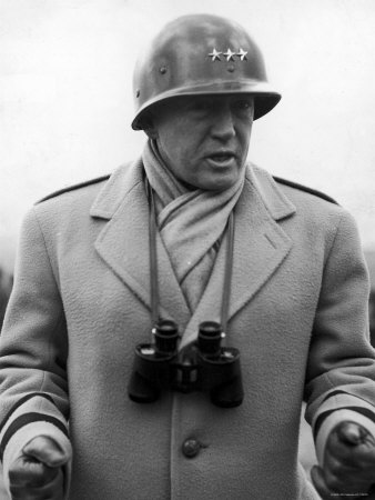
In early December 1944 General George S. Patton’s 3rd Army was stalled in its advance to the Siegfried Line along the French – German border. Patton was a master of combined arms operations and he knew he needed tactical air support from the Army Air Forces before he could breach the Siegfried Line and push on towards the Rhine River.

But the weather was not cooperating. The winter of 1944 was one of the worst on record for central Europe. Thick cloud decks and heavy fog were keeping Allied aircraft grounded all across France and the Low Countries. Patton was frustrated, impatient and angry.  He saw German resistance crumbling before him yet he knew he couldn’t push forward into the German homeland without adequate air cover. The 3rd Army and its supporting 19th Tactical Air Command ground attack squadrons were a deadly team. Ground-based artillery often had trouble keeping up with the 3rd Army’s advanced forces, but the Air Force’s growing fleet of attack aircraft like the rugged and deadly P-47 Thurderbolt could range ahead of the forward ground forces, striking military strong points, attacking enemy convoys and in general wreaking havoc and helping to open lines of advance for Patton’s armored formations.

In the second week of December Patton’s frustration hit a boiling point. Patton was a man of deep religious faith and he absolutely believed that God was on the side of the Allies. The General decided it was time to remind the Good Lord just who’s side he was supporting. On December 8th Patton put out an order directing all 3rd Army chaplains to pray for good weather. At the same time he called for his staff chaplain, Colonel James O’Neill.

I quote from Patton’s published diary of WWII, ‘War As I Knew It‘:

General Patton: “Chaplain, I want you to publish a prayer for good weather.  I’m tired of these soldiers having to fight mud and floods as well as the Germans. See if we can’t get God to work on our side.”

Chaplain O’Neill:  “Sir, it’s going to take a pretty thick rug for that kind of praying.”

General Patton:  “I don’t care if it takes the flying carpet, I want the praying done.”

Chaplain O’Neill:  “Yes, sir. May I say, General, that it usually isn’t a customary thing among men of my profession to pray for clear weather to kill fellow men.”

General Patton:  “Chaplain, are you teaching me theology or are you the Chaplain of the Third Army? I want a prayer.”

Chaplain O’Neill:  “Yes, sir.”

What Chaplain O’Neill came up with is one of the classic military prayers:

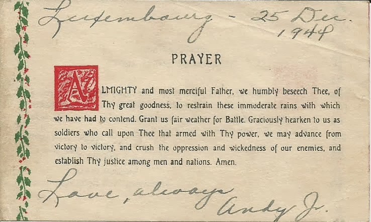
“Almighty and most merciful Father, we humbly beseech Thee, of Thy great goodness, to restrain these immoderate rains with which we have had to contend. Grant us fair weather for Battle. Graciously hearken to us as soldiers who call upon Thee that, armed with thy power, we may advance from victory to victory, and crush the oppression and wickedness of our enemies, and establish Thy justice among men and nations. Amen.”

After the war the chaplain, Monsignor James O’Neill (by that time a retired Brigadier General) wrote down his version of the story. It helps clarify some of the dates surrounding the event. In the classic movie ‘Patton’ starring George C. Scott we are led to believe that Patton ordered the prayer in reaction to the 3rd Army’s difficulty reaching the Ardennes as it advanced to relieve American forces trapped during the Battle of the Bulge. The truth is that Patton ordered this prayer at least a week before the Germans launched their offensive into the Ardennes.

Patton directed that the prayer, along with his Christmas greeting to the Soldiers of the 3rd Army, be printed and distributed just before Christmas. The printing job was immense. Virtually every Soldier in the 3rd Army was to receive a copy so hundreds of thousands of copies needed to be printed, and printed fast. The job was beyond the capability of the printing services available within the 3rd Army Adjutant General’s office. Chaplain O’Neill discussed the requirement with the 3rd Army Engineer and the decision was made to have the 664th Engineer Topographic Battalion, with its multiple large format offset presses, execute the print mission.

ba3f3-pattonsprayer1

 Patton’s Prayer printed on the back side of his Christmas greeting to the Soldiers of 3rd Army

d2396-pattonsprayer2

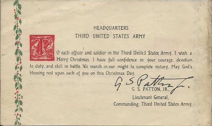
 Patton’s Christmas Greeting to the Soldiers of the 3rd Army

By December 14th 1944 the prayer was distributed throughout 3rd Army. On December 16th the German Army launched operation ‘Wacht am Rhein’ (‘Watch on the Rhine’) or as we refer to it today, the Battle of the Bulge. Hitler’s plan was to attack west through the Ardennes region in Belgium, capture the port of Antwerp, split the Allied armies in two and force the Americans and British to accept a separate peace. Within 24 hours of being notified of the German offensive Patton turned the entire 3rd Army 90 degrees and raced north to relieve the trapped forces. Patton smelled blood; the Germans had stuck their neck out and he intended to cut it off.  But he still had to contend with the weather.

For seven days the American forces trapped in the Ardennes pocket struggled to hold back the German onslaught, but were denied close air support due to the foul weather. Then suddenly, unexpectedly, on December 23rd the weather cleared. Allied aircraft could range freely over the Ardennes and they extracted a fearsome toll on the Germans. At the same time 3rd Army forces smashed into the southern flank of the German pocket, shattering and all but destroying the enemy forces before it. The German Army never recovered from the Battle of the Bulge and ‘Wacht am Rhein’ was the last offensive ever mounted by Hitler’s military.

Patton was convinced that the prayer, as applied by 3rd Army Soldiers, was instrumental in changing the weather in the Allies favor. In Patton’s mind it was confirmation that God was on his side and on the side of the 3rd US Army. For his part in composing the prayer Chaplain O’Neill was personally awarded the Bronze Star medal by Patton.

The story of Patton’s prayer is important to me for two reasons. First, the images of the card you see above are those of an original card issued to my uncle, Captain Andy Harbison. Andy was a battery commander in the 176th Field Artillery Battalion which was operating in General Support of 3rd Army. He signed the card and sent it home to my Aunt Dorothy (Dottie) Harbison in Buffalo, NY.

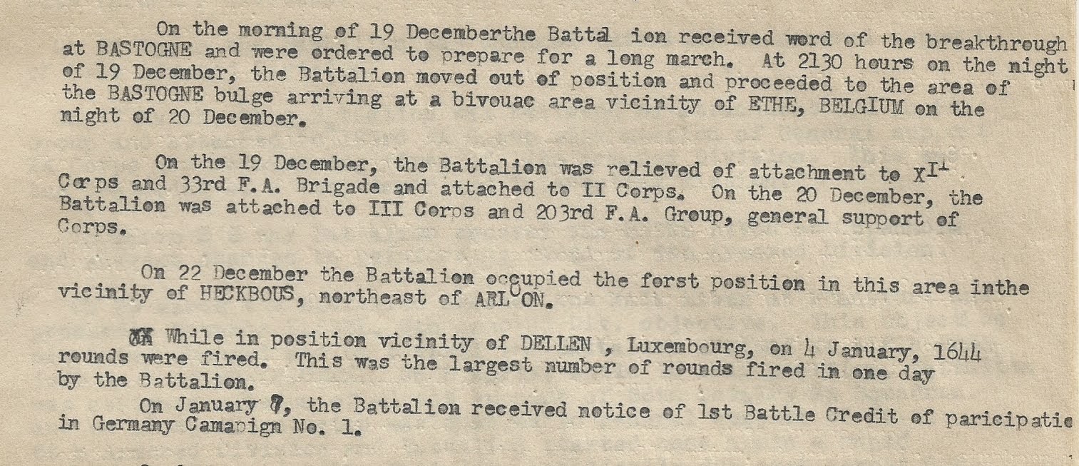
This extract from the 176th’s field log highlights the battalion’s involvement in the Battle of the Bulge.

176th FA Bn log

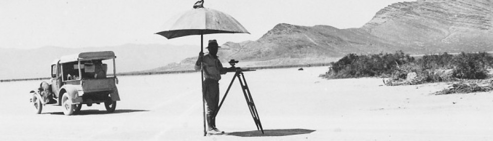
The second reason is the 664th Engineer Topographic Battalion’s involvement in the printing of Patton’s prayer. While not a ‘mapping’ mission, it still represents a fascinating piece of US Army WWII topographic history. Almost 39 years to the day after General Patton ordered these cards printed I reported for duty with the indirect successor of the 644th Engineer Topographic Battalion. As a young Engineer officer I found myself assigned to the 649th Engineer Battalion (Topographic) in Schwetzingen, Germany. The 649th provided topographic support – mapping, survey, terrain analysis and map distribution – to all US Army forces in the European theater. A tenuous connection perhaps, but I like to think that I am part of the legacy of units that helped the US Army achieve victory in WWII.

Like General Patton let me wish you all a Merry Christmas in the firm belief that the Good Lord is on our side.

– Brian

What Idiot Would Get Into a Bidding War For A Unit Crest

Me.

A week ago one of my pre-configured eBay searches triggered on an offering for a unit crest for the Army Map Service.

I see Army Map Service shoulder patches come up for auction now and then but I never saw a unit crest hit the auction site. This guy was offering just one (not the pair), but his opening bid was low – $2.50. So over the weekend I put in a top bid of $6.00 and figured surely, SURELY, nobody else in the eBay world would have an interest in something so esoteric. For days I was the only bidder and I figured I had the auction sewn up.

Then yesterday I get a notice from eBay that I had been outbid. Really? Someone had put in a series of bids, obviously to find out where my high bid stood. Well, they found my top price and outbid me at $6.50.

The challenge was on!. I bid $8.00 just to see where his high bid was, and found myself the top bidder again. Within a few minutes he came back and outbid me at $8.50. I went in and outbid him at $10.00 (by now you’re saying, ten bucks for a lousy unit crest?!). He shot back and outbid me at $10.50 (the other guy may have been persistent, but he was cheap). I went in and out bid him at $12.00. By now it wasn’t about the price. It was this guy trying to steal MY unit crest out from under me. Don’t laugh, eBay has made millions leveraging this weakness in the human psyche.

The other guy comes back and out bids me at $12.50. I figure it’s time to execute the nuclear option. I go in and place a top bid of $20.00. He comes back in and inches his bids up fifty cents at at time looking for my upper limit, but he reaches his at the $16.50 point.

Auction ends. I’m the proud owner of a $2.50 unit crest that cost me $16.50 (plus shipping).

AMS Unit Crest

But dammit, I WON!<

– Brian

Sailing To Philadelphia

I am Jeremiah Dixon
I am a Geordie boy
A glass of wine with you, sir
And the ladies I’ll enjoy

All Durham and Northumberland
Is measured up by my own hand
It was my fate from birth
To make my mark upon the earth

He calls me Charlie Mason
A stargazer am I
It seems that I was born
To chart the evening sky

They’d cut me out for a baking bread
But I had other dreams instead
This baker’s boy from the west country
Would join the Royal Society

We are sailing to Philadelphia
A world away from the coaly Tyne
Sailing to Philadelphia
To draw the line
A Mason-Dixon line

It’s amazing where you find historical references. I was listening to a radio talk show the other day and one of the bumper music selections was a duet by Mark Knopfler and James Taylor titled ‘Sailing to Philadelphia‘. The ballad tells the tale of Charles Mason and Jeremiah Dixon, surveyors who, in the mid-1700s, surveyed the boundary between the colonies of Maryland, Pennsylvania and Delaware. The song drew me back to a subject that has fascinated me for a long time – the story of the great boundary survey and how two talented individuals had such a huge impact on scientific and political history.

The Calvert family, which controlled Maryland, and the Penn family, which controlled Pennsylvania and Delaware, had been clashing for years over the boundary between the two colonies. At points the conflict became violent, and as European settlers pushed westward in both colonies the need to firmly establish the boundary became critical. In 1732 the Calverts and Penns agreed on a definition of the boundary: starting at a point formed by the intersection of a line of latitude set 15 miles south of the southernmost limit of the City of Philadelphia and a line of longitude that runs tangent to an 12 mile arc centered on the town of New Castle in Delaware. This definition of a political border as an arc highlights why politicians, particularly politicians with a weak grasp of geometry, should never be allowed to define borders.

After at least one bungled attempt to survey the border it became clear that the task required the best surveyors trained in the newest methods and using the best surveying and time keeping equipment available. In 1761 England’s Royal Astronomer James Bradley recommended two uniquely talented astronomers and surveyors, Charles Mason and Jeremiah Dixon, to tackle the job. Bradley also made sure they were backed by all the resources of the Royal Society and equipped by London’s best instrument makers.

The Royal Society properly viewed the task as one of the greatest scientific and technical challenges of the 18th century, a mission that would have far wider benefit to mankind than just marking a border between to quarreling colonies. It would help prove the utility of longitude determination using chronometers, would test the accuracy and precision of survey instruments made by England’s top makers, would establish the world’s longest and most precise survey baseline and ultimately would return data needed to help establish the precise length of a degree of latitude.

Mason-dixon-line

The Mason – Dixon line is actually two lines, or line segments. The east-west line, set at a latitude described as ‘15 miles south of the the southernmost limit of the City of Philadelphia and running five degrees of longitude westward from the Delaware River‘ is what is commonly viewed as the ‘Mason-Dixon line’. However, the north-south segment, set as a line tangent to a 12 mile arc centered in New Castle, Delaware, was actually the most challenging part of the survey. Establishing a line on the ground that is tangent to a continuous arc was a particularly difficult surveying challenge, and one that had never been successfully attempted before Mason and Dixon tackled it

Mason and Dixon had worked together for the Royal Society in the past and were an excellent team. They were also two of the most experienced field surveyors and astronomers of their time. No better team could have been found – their skills, experience, dedication and drive were unmatched.

Mason and Dixon arrived in Philadelphia in late 1763 and set immediately to work. They determined the southern boundary of the City of Philadelphia, established the latitude by astronomical observation, surveyed 31 miles west along the same line of latitude to clear the Delaware River and its local tributaries and established an observatory at a farm owned by John Harland. On Harland’s property they set a monument known as the Stargazers’ Stone on the same line of latitude they had determined at the southernmost boundary of Philadelphia.

1-2-2052-25-Stargazers-stone-CH

The ‘Stargazers’ Stone’ set by Mason & Dixon just north of Harland Farm in Embreeville, Pa.

In 1764 Mason and Dixon ran a survey line 15 miles south of Harlan’s farm and set an oak post (called the Post mark’d West by the surveyors) at 39° 43′ 26.4″ north latitude. This post marked a latitude point precisely 15 miles south of the southernmost limit of the City of Philadelphia. It served as the origin point, or point of beginning, for the survey.

For the remainder of 1764 Mason and Dixon worked on the north – south portion of the line to better define the border between Maryland and Delaware (remember – this was partly defined as a line tangent to a 12 mile arc arc centered on New Castle, Delaware).

In 1765 the pair began work on the line westward, and this effort consumed the better part of the next three years. The survey party consisted of over 100 workers – axmen, Indian guides, surveyors assistants, hunters, runners, teamsters and general laborers. The work was both physically and mentally demanding. The effort required teams of axmen hacking a westward line of sight through virgin wilderness up and over the Allegheny Mountains, the survey team directing their clearing work using compasses that had to be checked almost daily for local variance (declination). Distances were precisely measured using survey chains or rods. At intervals Mason & Dixon would stop, set up astronomical observation stations and verify the line was on the same precise latitude as set at the Post mark’d West. Any necessary corrections to the line were made, north or south, depending on the results of the observations, and the survey continued westward. Following behind, teams of workers set heavy stone markers at one mile intervals and at five mile intervals specially engraved ‘crown stones’ were set, with one side engraved with the Calvert family coat-of-arms, the other with the Penn family coat-of-arms. On more than one occasion, after field checks revealed errors, crews had to go back and move the markers to their correct location.

Masondixonmarker

A crown stone marker showing the Calvert coat-of-arms

The original survey was supposed to run five degrees of longitude (265 miles) west from the Delaware River to fix the western boundary of the colony of Pennsylvania, but at the 233 mile point the party’s Mohawk guides called a halt. They had reached the western-most limit of the agreement for the survey set with the chiefs of the Six Nations and would go no further. Mason and Dixon realized that, for now, the survey had reached its end. At the 233 mile point they set a stone pyramid to mark the end of the survey and headed east to Philadelphia to analyze their results and prepare their reports.

In the summer of 1768 Mason and Dixon delivered 200 printed copies of their maps, survey data and final report to the project’s commissioners. The Calverts and the Penns accepted the results of the survey and the boundary between the colonies was formally recognized. It wasn’t until after the American Revolution, in 1784, that the line was extended to the full five degrees of longitude, this time by two of America’s best astronomers, surveyors and instrument makers – David Rittenhouse and the remarkable and indispensable Andrew Ellicott.

Sadly, Mason and Dixon never worked together again. In 1773 Jeremiah Dixon was elected a fellow of the Royal Society and he soon retired to his native Cockfield a wealthy and well respected gentleman surveyor. He died young in 1770, unmarried and with no heirs. Charles Mason continued to work for the Royal Observatory and its new Astronomer Royal, the Reverend Dr. Nevil Maskelyne. But Dixon became disillusioned with his work in England and lack of recognition for his continued contributions to astronomy. Nevil Maskelyne was well known as a ‘glory hog’ who often refused to give credit and recognition to others contributing to projects under his direction. While working on the boundary survey Mason had become good friends with many American scientific luminaries such as Ben Franklin and David Rittenhouse. Mason likely figured his talents would get more respect in the former colonies. In early 1786, while in bad health, he sailed again for Philadelphia with his wife and eight children. On arrival he communicated briefly with Benjamin Franklin but died in late October 1786 and was buried in the Christ Church cemetery in Philadelphia.

Mason and Dixon’s work on the boundary line was recognized in its time as an outstanding scientific achievement. In the mid-18th century the science of geodesy – the study of the shape of the earth – was in its infancy and there were a lot of unanswered questions. The best minds of Europe, particularly in France and England were turning their efforts to developing a better understanding the size, shape and form of the earth. At the time the best ways to work out these questions was to study closely the detailed results of ‘great arc’ surveys – highly accurate surveys that covered great distances. In 1830 the first great leap in applied geodesy occurred when Astronomer Royal George Airy published the first accurate spheroid of the Earth. A spheroid is a mathematical definition of the size and shape of the earth, and an accurate spheroid definition is the foundation on which accurate mapping and surveying is built. To calculate his definition Airy used multiple ‘great arc’ survey results provided by British, French, Russian and German scientists, but the only great arc survey he used to define the Western Hemisphere was the boundary survey conducted by Mason and Dixon some 70 years previously.

Good work stands the test of time, and Mason and Dixon’s survey remained one of the most accurate boundary surveys conducted in the Americas well into the 20th century. Even today surveyors using modern GPS-based systems marvel at the accuracy and precision these mid-18th century surveyors achieved. So the next time you cross the state line between Pennsylvania and Maryland remember the two geniuses who’s colonial-era work to settle an argument over a property line ended up helping to accurately define the shape of the planet we live on.

– Brian

Post script – as with so many of my posts on this blog, I stood on the shoulders of giants while writing this one. There’s a lot of good material covering Mason and Dixon’s boundary survey available on the web. John Mackenzie of the University of Delaware has published perhaps the best one page history of the survey available on the web (although his essay ends up wandering into territory I think should have been saved for a separate posting). But the story of the boundary survey and Mason and Dixon’s efforts really needs a book to cover fully and adequately. We are fortunate that Edwin Danson has written a wonderful volume that covers the background on the survey and a full accounting of Mason and Dixon’s work. Danson’s book is titled ‘Drawing The Line‘ and in my mind it stands with other modern classics of popular science history like Dava Sobel’s ‘Longitude’ or John Wilford Noble’s ‘The Mapmakers’ as a must read for anyone interested in the topic.

Origins of the Military Grid Reference System

Several weeks ago John Carnes, owner of the Maptools.com website, contacted me with some additional information regarding the origins of the Military Grid Reference System (MGRS). It appears John has a friend who had some interest in the origins of MGRS and back in 1994 contacted the Defense Mapping Agency looking for information.

John Hager, a geodesist with DMA, responded with a detailed letter and references tracing the history and origins of MGRS. John Carnes has taken this information and created a very informative page on his website. I encourage you all to go to John’s MGRS history page and read up on the history of MGRS and review the links he provides. There’s a lot of great historical information there!

Some points and observations I gleaned from reviewing the documents:

  • The Universal Transverse Mercator Grid system (UTM) was developed far earlier than I thought. Based on my previous reading I thought that UTM had been developed by the Army Map Service specifically to support the development of a world-wide grid reference system like MGRS. However, it appears that the U.S. Army adopted UTM in 1937, years before the creation of the Army Map Service.
  • The original MGRS structure as proposed in 1948 had it covering globe in an area from 80° north latitude to 80° south latitude. Above and below 80° the polar regions were to be covered using the Universal Polar Stereographic (UPS) coordinate system. However, some time after 1948 the MGRS coverage was extended to cover up to 84° north latitude. MGRS was extended into this region as a reflection of NATO’s anticipation of having to fight a ground war with the Soviet Union in arctic regions.
  • There’s a lot of concern expressed by a lot of people in these documents regarding grid zone intersections, or ‘zippers’ as we referred to them. Everyone understood these grid zone intersection areas posed critical challenges and demanded extra caution when directing operations that crossed an intersection boundary. In fact, the issue so concerned the British that they expressed a preference for a less accurate ‘mesh’ grid system that would eliminate grid zone intersections altogether. One of the reasons UTM was selected as the foundation to build MGRS on is because its narrower 6° wide zones introduced less error in these intersection areas.
  • As good as the UTM/MGRS system was (and still is) the fact that it had to be built on ‘local’ datums like NAD27 (in the US), ED50 (in Western Europe) or the Tokyo Datum (in Korea) quickly revealed the need for a world-wide datum, one that was equally good (or as one of my survey instructors put it, “equally poor”) across the globe. This need led directly to the World Geodetic System of 1984, or WGS84, the datum on which all US and NATO military maps are currently based.

So put your geo-geek cap on, head over to John’s website and read up on the origins of MGRS. These documents outline the background of the grid system many of us have a love-hate relation with, yet it’s a grid system that has stood the test of time in places like Europe, Korea, Vietnam, Kuwait, Iraq and Afghanistan, and is now adopted for official use here in the United States as the US National Grid.

– Brian

Terrain Models – WWII Style

In a previous post I discussed the issue of terrain models and how the requirement to build them was often the bane of my professional existence. Since we received no training on the construction of terrain models most of the time we were just winging it, making sure that the general terrain was well represented and laying in key topographic and geographic features like important towns, cities, roads, rivers, etc. These models got the job done, but they certainly weren’t elegant. I knew we could do better, but frankly I wasn’t about to waste any more personnel resources than necessary. My Terrain Analysis units were always over tasked and under resourced, and every hour my Soldiers spent putting together a terrain model was an hour stolen from a more important requirement. The fact is, I wanted the finished product to be somewhat crude in the hopes that we’d never get asked to do it again.

Nevertheless, terrain models are an important tools for military planners and unit leaders and the demand for accurate terrain models has always existed. The demand reached a zenith during WWII when planning for major operations like the invasion of North Africa (Operation Torch), Italy (Operation Husky) and France (Operation Overlord) reached a fever pitch. Commanders at all levels demanded accurate terrain models for use as briefing, planning and rehearsal tools.

To provide some level of standard guidance, in June of 1944 the Army Map Service published a bulletin covering the construction of both terrain models and physical relief maps. What this bulletin describes are not simple sand tables, but complex, accurate and detailed models prepared by skilled model makers in a controlled production environment. Frankly I think this bulletin may have done more harm than good; I can envision senior WWII field commanders waving it in the face of their Topographic Engineer officers and yelling, “See, the Engineer branch has even published an official how-to manual. Now get out there and make me a terrain model!” In a sense I’m glad I never ran across this or any similar publication while I was on active duty. Copies of this bulletin are somewhat rare and I have to wonder if most of the copies weren’t burned over the years by Topographic Engineer officers desperate to hide the evidence.

Still, it’s an interesting publication and one worth studying to realize just how complex and difficult making accurate terrain models really is (just click on the image to open the document).

Page 1


Enjoy!

Brian

Patton Shoots an Azimuth

In 1942 George S. Patton was one of the fast rising stars in the US Army. In less than two years he had leapt from the rank of colonel to major general and went from commander of an armored brigade to commanding the 1st Armored Corps and the newly formed Desert Training Center in southern California (now known as Fort Irwin and the National Training Center). The 1938 – 1942 period was a time of explosive development and innovation in the US Army. War was on the horizon and our national leaders accepted the fact that America would be involved. There was a mad scramble to get our military the personnel, money and equipment needed to get ready for the inevitable. After almost two decades of neglect the US Army suddenly found itself flush with cash and manpower, and new equipment was coming on-line every day. Experienced officers who were innovative thinkers found themselves skyrocketing up the ranks as the new Chief of Staff of the Army, George C. Marshall rushed to fill the newly created command slots

Patton was a natural pick for Marshall. They were contemporaries and both had made a name for themselves during WWI. Patton had commanded the Army’s only armored forces during the war and was a full throated advocate for they type of fast moving mechanized warfare that would be needed on the battlefields of Europe. Between the wars Patton wrote extensively on mobile warfare for the Army’s professional journals and many of his ideas found their way into the Army’s doctrinal manuals. So in 1941 when General Marshall needed a tough, experienced officer to take over training for the Army’s newly formed armored forces he looked no further than George S. Patton.

Patton was given command of the 1st Armored Corps and told to find land suitable for training large mechanized forces. A Southern California native, Patton knew the large empty desert tracts east of Palm Springs was the perfect location. He established the Desert Training Center (now known as Fort Irwin and the National Training Center), moved his headquarters there and began the task of getting the Army’s armored units ready to beat the German army at their own game.

But what good is a highly trained, well equipped armored force if they don’t know where to go? Well, during this same 1939 – 1942 time period there was an effort going on with the Army Corps of Engineers and the Infantry School to standardize map production, adopt a new type of compass and develop innovative map reading and land navigation training programs for the entire Army. One of the results of this effort was the development of the M1938 lensatic compass. We know Patton was keenly interested in land navigation. He regularly used National Geographic and Michelin road maps during maneuvers and was often heard complaining about the shortage of standard military maps his armored forces needed to navigate across the battlefield.

The Army would have shipped the newly adopted M1938 compass to the Desert Training Center for testing and evaluation, and one of these compasses would have made it into Patton’s hands. Patton was a detail man and took a keen interest in everything his Soldiers were issued. He considered it part of his leadership responsibility to make sure a Soldier’s equipment worked. It makes perfect sense that Patton would have gotten his hands on one of these new compasses and put it through its paces.

Sometime in early 1942 a photographer asked General Patton to strike a pose doing something dramatic. I don’t know who’s idea it was to have him pull out his compass and shoot an azimuth to a distant point, but the resulting photo is interesting. Patton is standing beside his early M3 Stuart command tank and decked out in full battle regalia – tanker helmet and goggles, tanker jacket, binoculars, signature pistol at his side and an M1938 compass in his hands.

Patton With Compass

Just a few months after this photo was taken Patton would be pulled from his assignment as commander of the 1st Armored Corps and placed in command of the Western Task Force for the Allied invasion of North Africa. It’s at this point the common legend of General Patton begins, but we should always remember that he was instrumental in developing much of the Army’s early armored warfare doctrine and pushed hard for improved maps and map reading skills.

Greetings From The Panama Canal

I’ve been fascinated by the Panama Canal and its history for years. Before 1993 I didn’t give the ‘big ditch’ much thought, then one day in ’93 I got a phone call from my Army assignments officer telling me I’d been selected to do a tour with the US Army South headquarters at Fort Clayton in the old Panama Canal Zone. At first I resisted, thinking an assignment to Panama in the waning days of American influence was a backwater job (which it was), but my good friend Gil Rios, who had spent several years in Panama, called and told me that it was a damned interesting place and that I’d have a lot of fun (which I did).

Before heading down there my wife and I read everything on Panama we could get our hands on. This included David McCullough’s excellent one volume history of the Canal, Path Between The SeasI also got the opportunity to dig through the Fort Belvoir, Virginia post library (home of the US Army Engineer School) to review their fairly extensive historical holdings on the Panama Canal. Since the US Army Corps of Engineers had a significant hand in the design and construction of the Canal a lot of reports, pamphlets, books and articles were written by Engineer officers, and many of those papers made their way to the Fort Belvoir library. We read our books, got our shots, packed our household, said goodbye to friends and family and headed to Panama.

Our time in Panama proved to be just as interesting as Gil promised. My geospatial team ended up working on counter drug projects across Central and South America. We also got pulled into a wide range of Panama Canal turn-over issues, working to identify abandoned US facilities across the isthmus, assisting in property remediation studies and conducting analysis on the effects of deforestation on siltation levels in the Canal. Our daughters enjoyed endless summer in a tropical paradise and experienced first hand a culture and and environment that few other American children got to see.

One of the things I took away from this experience is a life-long fascination with the Canal and its history. Along the way I became an accumulator of  Panama Canal bric-a-brac, particularly if it has a topographic connection. In the early 1900’s America was fascinated by the Canal and proud of our nation’s achievement in building it. Magazine articles, professional publications and early newsreels gave Americans a peek at what was going on in a place so exotic yet not so far away. We were conquering disease, rugged topography, rain, raging rivers and dangerous rock slides to join the oceans and improve world commerce. This triggered a flood of Panama Canal ephemera – publications, maps, photos, commemorative coins, plates and post cards. Lots and lots of post cards. Most of these knickknacks sported a map, because to understand the Panama Canal and its relationship to the United States you need to put it in geographic context.

So today we’ll take a look at one of the more unique Canal related items I’ve come across. It’s a standard sized post card published by I. L. Maduro in Panama City and is likely a reprint of a report published by the Panama Canal Company in the early years of the Canal’s operation.

Panama Canal Postcard Front

Click to open in a new window

What makes this card unique is that it’s an information dense geographic analysis. It effectively combines a nicely done relief map with a corresponding elevation profile that serves as a comparative chart highlighting the difference between material removed during the initial French effort to dig the canal (1881 – 1893) and the subsequent and successful American effort (1904 – 1913). The card also includes key statistical information about the Canal – passage times, channel depths, lock sizes, construction cost, workforce size and other interesting tidbits. Also included is a mileage chart that highlights the amount of shipping distance saved by using the Canal. This was a thinking man’s post card, a high level engineering report squeezed onto a 3.5″ x 5.5″ piece of cardboard. Even more interesting, the map is embossed; it has raised relief, making it a miniature physical relief map.

Overall it’s extremely well done. Yes, you need a magnifying glass to read all the information, but that’s OK. It’s worth the effort. I can imagine hundreds of professional men visiting the Canal Zone or transiting the Canal stopping off and picking up one or more of these post cards to help them explain to friends and family just what a unique and extraordinary achievement the construction of the Panama Canal was. That’s why these cards are not particularly rare. A quick eBay search for ‘panama canal post card’ will usually turn up one or more of these for sale or auction.

But let’s remember this is a post card, designed to be scribbled on and dropped in the mail. So it is with this particular card. In 1934 Uncle Gerry mailed it from Panama to his nephew Don at a YMCA camp in Connecticut. Just what was Uncle Gerry doing in Panama? Was he a crew member on a ship transiting the Canal? Was he working for the Panama Canal Company? Was he a tourist who dropped in to see what this big ditch was all about? We’ll never know, but it’s fun to speculate.

Panama Canal Postcard Back

The Panama Canal was an outstanding American engineering achievement that continues to serve world commerce. We turned the Canal over to the Panamanians in 1999 and they continue to operate and improve it, most recently expanding it to handle the newest generation of supercargo carriers. This has triggered a ‘port war’ here in the US as various cities along the eastern seaboard scramble to improve their port and rail facilities in an effort to capture a larger share of the increase in shipping traffic. Over 100 years after it’s opening it’s great to know that the Canal is still contributing to the world’s commerce. That’s precisely what the thousands of engineers, surveyors and laborers were working towards back at the dawn of the 20th century.

Brian

Project Casey Jones

Casey Jones Cover Sheet

Yesterday I was poking around eBay looking for things I just can’t live without when I stumbled on an auction that caught my eye. One of my canned eBay search criteria – ‘aerial mapping’ – triggered a hit for an auction for a US Air Force publication on something called Project Casey Jones. The subtitle was the real attention getter: ‘Post-Hostilities Aerial Mapping; Iceland, Europe, North Africa, June 1945 – December 1946′.  I was intrigued but the eBay seller was asking far (far) too much for the document. But since this was an official USAF publication I figured there was a good chance it was already available on-line in digital format. A quick Google search turned up a the document in PDF format on an on-line library and I grabbed a copy.

As I started to read the report it dawned on me that I never really knew where the base mapping imagery came from that allowed the Army Map Service to re-map all of western Europe and North Africa quickly and accurately right after the close of WWII. I just assumed the aerial photo missions were done on a piecemeal as-needed basis by US assets or we collaborated with host countries like France or Italy to obtain civilian aerial photo coverage.

As it turns out the collection of aerial mapping imagery at the close of WWII was a far more centralized and directed effort than I could have imagined. The fact that the project was carried out so quickly, comprehensively and effectively is remarkable and is one of the great untold stories in the US Army’s topographic history.

In 1944 it was clear to senior Allied leadership that Germany’s days were numbered and thinking started to turn to projects that would help secure the US position in post-war Europe. A huge issue that had emerged from both the ground and air campaigns in Europe was the lack of accurate and up-to-date maps and air charts. During the war the Allies’ mapping services, like the US Army Map Service, scrambled to meet the demand for large and medium scale maps. They often relied on outdated local maps of dubious accuracy, supplemented where possible by photo mosaics or photomaps based on aerial photography taken by reconnaissance aircraft. The science of mapping using stereo aerial mapping photography was well understood at the time, and the US Army Air Force (USAAF) had the necessary cameras and aircraft at their disposal, but flying long, slow and precise flight lines over enemy held territory was out of the question while both sides were still shooting at each other.

Allied military leadership realized that once the shooting stopped there would be a very short window of opportunity during which they would be able to fly photomapping coverage of most of western Europe. The idea was to get the job done while the American’s still had the political clout and the resources in Europe. The US Government and the USAAF applied a carrot and stick approach to the problem. In concert with the British Royal Air Force, the USAAF would fly the conquered territories (Germany, Austria, Italy, etc.)  at will (“we won, you lost, tough luck”), and the Allied, newly liberated or neutral nations (France, Spain, Switzerland, Netherlands, Belgium, etc.) would be offered a copy of all aerial imagery collected over their territories (“we’re your friends and we’re just helping you get back on your feet”). In the end it worked, and over two million square miles of new stereo aerial imagery was collected in about 18 months.

Casey Jones Airfields

The Project Casey Jones report brings to light some very interesting historical tidbits. The first were the technical issues. How do you keep a big, heavy bomber like a B-17 on a straight, steady course for hundreds of miles? The answer turned out to be ingenious. After the pilots failed multiple early attempts to keep the aircraft flying straight and level the job was turned over to the bombadiers and their Norden bomb sights. Since the Norden bomb sight effectively took control of the aircraft once the bombing run to the release point was initiated – controlling aircraft attitude, direction of flight and compensating for wind drift and other factors – it became a relatively simple matter to re-program the sight so that visual check points along the photographic flight line became the ‘release points’, and the bombardier actually controlled the flight by flying from check point to check point along the flightline path using the Norden. Simple but effective.

norden-bombsight

Norden bomb sight in the nose of a B-17. From this station the bombardier took control of the aircraft and flew from check point to check point along the flightline. Many of the flightlines were 200 or more miles long

The other interesting factor was quality control. The USAAF was flying to meet US Army Corps of Engineer (Army Map Service) requirements and had to adhere to mapping imagery standards for image overlap, side lap, aircraft attitude, cloud cover, haze and other factors. In the beginning the rejection rate of aerial imagery was unacceptably high – some flight crews only hitting the mark 20% of the time. Part of the problem was a lack of familiarity with the mission, part was mechanical problems with the installation of the mapping camera systems, and part was weather and atmospheric conditions. To help solve the problems and improve the success rate for the photo missions the Corps of Engineers put photomapping officers and technicians in each of the squadrons. These personnel would grab the film as soon as the aircraft landed, develop it and quickly review it while the flight crews were still in the area. They could do a quick post mortem on the success or failure of the flight and provide the crews with valuable feedback on what was needed on upcoming missions. As air crew experience increased the success rate increased, and towards the end of 1946 the success rates for each mission hovered around 60%.

Other factors worked against the project; weather during one of the worst winters in modern memory (1945 – 46), high personnel turn-over rates caused by rapid demobilization and political issues that delayed or canceled overflight permission. But in the end the USAAF was successful, and Project Casey Jones was effectively complete by September 1946.

So what became of the two million square miles of mapping photography flown during Project Casey Jones? It was immediately transferred to the the Army Map Service and was used as a primary cartographic data source for at least the next 20 years. It was used in the wide-scale production of up-to-date tactical and operational scale maps of western Europe by American and British military mapping agencies, maps that supported the operational backbone of NATO well into the 1960’s and perhaps beyond.

Brian

Ted Abrams

Yesterday the December issue of American Surveyor magazine appeared in my mailbox. American Surveyor is one of the few trade publications I read from cover-to-cover every month, and it’s one of the very few I’d gladly pay a subscription fee for. But since the publisher, Cheves Media, provides it free of charge all the better.

American Surveyor DecCover2015full

This month’s issue hits it out of the ballpark. The cover is one heck of a teaser – a beautiful shot of the John Bird transit telescope used by surveyors Charles Mason and Jeremiah Dixon to establish the boundary between Pennsylvania and Maryland just before the Revolutionary War. This is the famous ‘Mason – Dixon line’ that today is viewed (incorrectly) as the cultural and political dividing line between the American North and South. Mason & Dixon’s achievement is an important topic in the history of topography in the Americas and we’ll have more on it in a later post.

Today however we’ll focus on the other key article in the magazine – a short overview of the achievements of Ted (Talbert) Abrams, an early pioneer in the science of photomapping and and photogrammetry. Abrams was one of the quiet heroes of topographic history, someone most have never heard about but who’s accomplishments revolutionized science, established an industry and helped found the geospatial profession many of us practice in today.

Ted Abrams

Just what were Ted Abrams’ achievements? He effectively invented the business of photomapping. It was his experience as a US Marine Corps reconnaissance pilot during WWI that convinced him that aerial photography could be used to make highly accurate maps. At the time traditional mapping technology required the use of ground survey and field verification crews to literally walk and survey the areas to be mapped, usually using laborious plane table survey methods. The process was slow and expensive. One of the earliest uses of aircraft during WWI was to take vertical photos of battlefields for the creation of map substitutes. These were simple photo mosaics annotated with things like road and town names, but they filled a critical need.

Coming out of the war Abrams was convinced that photomapping could not just be a viable business, but could revolutionize the science of large scale mapping over broad areas. Ted Abrams was part pilot, part scientist and part entrepreneur, and all genius. Where no industry existed, he developed the techniques and the instruments necessary to capture and process tightly controlled areal mapping photography and compile accurate maps from that data. He then developed the business model that made it all profitable. He also helped develop a lot of the science behind the processes involved in photomapping. You can’t claim your maps and photo mosaics are accurate unless you can prove the mathematics and geometry that went in to making them, and Abrams was an early pioneer in developing the mathematical principles behind processes like aerotriangulation.


Ted Abrams was also a life-long patriot and a proud Leatherneck. During WWII he set up schools that trained thousands of Marine Corps photo mapping and photo analysis specialists, and his techniques and textbooks were in wide use across all the military services. One of his simplest yet greatest accomplishments was the invention of  the folding pocket stereoscope. This stereoscope was manufactured by the hundreds of thousands by the Abrams Instrument Corporation and other manufacturers and became the indispensable tool of photo interpreters, surveyors, cartographers and intelligence analysts around the world.

Frost Course Module 3 blow-up

Invented by Ted Abrams in 1942, the simple folding pocket stereoscope has been the indispensable tool of topographers for over 70 years. They are still in wide use today

After the war Abrams’ business flourished as America went on a building boom. He built Abrams Aerial Survey into the leading aerial survey firm in the United States and the Abrams Instrument Corporation became a leading supplier of aerial photography, photogrammetry and aerial photo analysis instruments.

Ted Abrams was a founding member of the American Society of Photogrammetry (now the American Society of Photogrammetry and Remote Sensing (ASPRS)) and much of his pioneering work made its way into the first editions of the industry’s standard reference, the Manual of Photogrammetry.

Manual of Photogrammetry

In recognition of Abrams’ contributions the ASPRS presents the Talbert Abrams Award every year to ‘encourage the authorship and recording of current, historical, engineering, and scientific developments in photogrammetry.’

One last example of Ted Abrams’ genius. He came out of WWI with a clear understanding of the limitations of current aircraft designs when used as platforms for aerial cameras. Abrams knew he needed a more stable aerial survey platform designed around the needs of the camera system and crew. In the 1930’s Abrams sat down and designed what became the world’s first dedicated aerial imagery platform – the Abrams P-1 Explorer.

Abrams_P-1_Explorer

First flown in 1938, it was specifically designed for the mission of acquiring aerial mapping photography. The P-1 incorporated a number of unique design elements, including a pusher-type engine arrangement designed to keep leaking oil and fluids from smearing the camera lenses (a serious problem with conventionally laid out aircraft using rotary engines), and it was one of the earliest aircraft to utilize Plexiglas for windows. In fact the nose layout made its way into WWII military aircraft designs, particularly the nose arrangement of the early B-24 Liberators.

Unfortunately the P-1 design was a victim of war. By the time the aircraft became operational proved itself as an outstanding aerial camera platform WWII had broken out. The US Army Air Corps looked at the design and deemed it too slow and too vulnerable to enemy fire. Ted Abrams realized he needed to work on ways to mount mapping camera systems in fast moving fighters and modified bomber aircraft and threw himself into the task without looking back. Only one model of the P-1 was ever built and it remained in operation in the US until 1948.


A fascinating aircraft designed by a true genius and pioneer in our industry. We truly do stand on the shoulders of giants.

Brian

Mapping The History Of The ATL

Candler Field Post Card 2

Over the years in this blog I’ve obliquely referred to where I work as “the world’s busiest airport”. Most of my friends know that I’m referring to Hartsfield-Jackson Atlanta International Airport (H-JAIA) in Atlanta. The city of Atlanta is often referred to as “the ATL” but the term ‘ATL’ is actually the International Air Transport Association code that identifies H-JAIA in airline ticketing, reservation and baggage handling systems. When your flight destination is Atlanta the ticketing agent slaps a big ATL tag on your luggage to let the baggage handlers know where it needs to go. The younger generation in Atlanta has latched onto the term “the ATL” to describe their city, and I think it’s an interesting way of acknowledging the part the airport has played in the growth of the Atlanta region over the past 30 years.

A lot of folks get confused when they think of H-JAIA. Some think it’s the world’s largest airport. It’s not – far from it. Lots of other airports occupy more ground. H-JAIA’s claim to fame is that for the past decade or so it has been the world’s busiest civilian passenger airport. As of this date H-JAIA is serving over 250,000 traveling passengers per dayThat’s more passengers per day than many airports handle in a week, a month, or even a year!

But how did H-JAIA get to where it is today? You don’t just build an airport and a quarter million passengers magically appear. The story of Atlanta’s airport is the story of concerted efforts on the part of a succession of mayors, starting with William B. Hartsfield and extending right up to today’s mayor, Kasim Reed, to build, promote and maintain the city’s airport as an engine of economic growth for the Atlanta region and the entire southeastern United States. But growth means construction and expansion, and that’s why we are here today.


One of my jobs at H-JAIA is managing the airport’s aerial imagery program. In fact, before my team came on-board in 2007 there was no formal aerial imagery program. Aerial coverage of the airport was occasionally flow by government agencies like the US Geological Survey or the Soil Conservation Service, and in later years by contractors working large projects at the airport, but there was no Atlanta airport-managed and funded effort to acquire standard aerial imagery for use in the airport’s CAD and GIS systems. The engineering and design staff at the airport just relied on hand-me-downs and took whatever imagery they could get.

Once we got the aerial imagery program in place (we now have the airport flown once a year for orthorectified coverage at high and medium resolutions) staff at the airport started asking if it would be possible to ‘register’ successive years of imagery in an effort to track the changes that have taken place at H-JAIA. I was intrigued by the request. We had a small but growing catalog of aerial images and I thought it would be fun to take on the challenge.

A persistent rumor among many of the long-time employees in the airport’s planning & development division was that the airport got its start years ago as a racetrack. Now, nobody could define what ‘years ago’ meant. Some said maybe 50 years ago, others said 75. They just knew it was a long time ago, before they started work at the airport. In addition nobody could tell me precisely where this racetrack had been located. They only knew it had to be somewhere on the north side of the airport property since the airport’s growth over the decades was a steady march from north to south. Sadly, decades of airport expansion had obliterated all traces of it.

Some folks offered up old postcards and oblique aerial photos that depicted the race track. Clearly it had once existed, but where?

Atlanta Speedway postcard

An early postcard showing the speedway. The problem is, the artist got a lot wrong. The stands and supporting buildings were never as grand or extensive as shown in this drawing, and the layout is actually the reverse of what was actually built. My guess is this is a copy of a conceptual drawing or plan that got turned into a postcard

Atlanta Speedway oblique_orig

Oblique aerial photograph of the Atlanta Speedway race track taken around 1919 and looking to the northeast. OK, there clearly had been a racetrack, but where was it in relation to the modern airport?

Even the Civil Aeronautics Authority (forerunner to the FAA) got into the act and published an early airport data sheet that clearly shows the remnants of the racetrack with the new post-war pattern of runways and taxiways overlaid on it

Atlanta Airport Data Sheet circa 1940

1946 Atlanta Municipal Airport data sheet

By this time I was getting a good bit of help. Several co-workers – Bill Beckwith, Dottie Gandee and Talley Jones – all aviation history buffs, started digging through their resources and finding interesting tidbits. One day Talley came to me with an aerial photograph of the airport taken in 1940 by the US Soil Conservation Service. It was an ‘ah-ha!’ moment. There in the upper center of the photo was the clear outline of remnants of the racetrack along with the early runways and taxiways. But just as important, the photo also showed street intersections in the surrounding communities of College Park and Hapeville. These street intersections would prove critical to ‘registering’ or georeferencing this aerial to more recent airport images.

Candler Field 1940

Atlanta’s airport, 1940. At the time it was known as Candler Field. The image is rotated just a bit as a result of the georeferencing process and is oriented to true north

Soon more aerial photos came my way. In particular the 1949 aerial shows the growth of the airport spurred by the rapid expansion of civil aviation after WWII and Atlanta’s early moves to establish itself as the major hub airport in the southeast.

Atlanta Municipal Airport 1949

Atlanta Municipal Airport, 1949

I found myself with great aerial images separated by a wide gulf of time and change. I had our modern, highly accurate orthorectified aerial images tightly tied to the Earth’s surface and old, historically significant aerials with no ties to anything. It was time to get to work and georeference the old to the new.

The process of georeferencing is easy to understand. You have two images, one of which is already georeferenced, or ‘tied’, to the Earth’s surface. Using common tie points – things like road intersections or key natural features seen in both images – you use the controlled (georeferenced) image to bring geographic values (x & y) onto the same points in the uncontrolled image. When the process is complete the uncontrolled image is now georeferenced and will automatically line up with any other georeferenced image or map.

An accurate georeference process requires the use of several common tie points evenly distributed around the images. For example, if all of your common points are clustered in the upper left of your images then the accuracy of the georeferencing process will rapidly fall off as you move towards the lower right of the uncontrolled image. This is precisely the issue I ran up against when trying to georeference the older 1940 and 1949 aerials to our modern orthorectified images. As the airport grew to the south it wiped away all traces of the old road patterns seen in the southern portions of the old photos. While there were road intersections in the upper parts of the old aerials that were still visible in the current images that made good tie points, there were no common points available as we moved south, away from the Hapeville and College Park areas. Atlanta’s airport had literally bulldozed away entire communities, farms and roads as it expanded southward. Where there were road intersections, houses, churches, farm fields and fencelines in the 1940 and 1949 aerials there was nothing but runways and taxiways in the modern images. I was stuck.

1940 vs 2013 comparison

Here was the problem. As part of airport expansion projects over the decades Atlanta’s airport bulldozed away most of the common reference points like road intersections that would have allowed accurately georeferencing the historic images to modern imagery. (Click to enlarge)

Then one day I was looking through the US Geological Survey’s (USGS) on-line historical topographic map library and found the 1955 1:24,000 scale topographic quad sheet for East Point, GA. These historical topo sheets are high quality scans of the original paper maps and have been georeferenced. As I looked at the 1955 quad sheet and the 1940 & 1949 aerials I realized I had found my Rosetta Stone. The 1955 topographic map and the aerials all shared evenly distributed tie points and I could use the map to accurately georeference the images. While this 1:24,000 scale topographic map is not a highly accurate control source, it was more than good enough for this job.

Atlanta Airport topo 1955

The Rosetta Stone! Portion of the 1955 edition of the USGS East Point, GA topographic quad sheet. Using this map I was able to accurately georeference a series of aerial images extending from 1940 to 1972

Here’s a graphic that shows how the georeferencing process works. The process is handled by our ArcGIS desktop software which offers powerful tools to georeference a wide variety of maps, images, charts, CAD drawings or any other data that can be tied to a ground location.

Georeferencing Example

How georeferencing works. The concept is as old as map making itself, but modern GIS software makes it fast, easy and accurate


So let’s get back to the original question – where was this racetrack? Well, now that we had the 1940 aerial georeferenced it was a simple matter of tracing the racetrack from the aerial and creating a new GIS data layer that could be used in a wide variety of maps. Mystery solved!

Atlanta Speedway 1940

Alignment of the Atlanta Speedway, 1940. Remnants of the speedway are still visible in the image, permitting accurate tracing of the alignment

Atlanta Speedway 2014

Alignment of the Atlanta Speedway against the 2014 aerial

But what to do with all this great information? It’s a shame to keep all this airport history locked up on a hard drive. Just a few years ago if someone wanted to view our historical imagery we were limited to printing paper maps or relying on emerging and not-yet-mature web mapping technologies to put this information out on the Internet. But times have changed, and with modern image caching technology and cloud-based web mapping platforms we can share this web map to the world. So click the web map icon below and explore the history of Hartsifield-Jackson Atlanta International Airport as told through aerial photography and maps. The available map layers start with a 1936 airport development plan drawn up by the Works Progress Administration and carry through to our 2014 aerial basemap.

Historic Airport Viewer

Click to open the web map

The web map was built using ESRI’s Web App Builder technology and all data is hosted via the airport’s ArcGIS Online website. If you have any questions or comments please feel free to add them to the comments list below.


This post is about the history of the airport as told through aerial photography. For a more in-depth look at Atlanta’s extensive aviation history I invite you to visit David P. Henderson’s excellent Sunshine Skies website.

Sunshine Skies

Brian