It’s Throwback Thursday!

Everybody does ‘throwback Thursday’ these days, so why not me.

I came across these quirky but interesting (for a topo geek and an airplane geek) video clips on YouTube and thought I’d share them.

First, a nod to our Air Force friends. From WWII right on through the 1980s the Army Topographic services relied on the US Air Force for wide-area mapping photography support. The Army did pick up some missions using its fixed-wing intel platforms like the venerable Grumman OV-1 Mohawk, but for the most part it was the Air Force (or the Air Force Reserves or Air National Guard) who handled the military requirements for mapping photography. You can read more about the USAF’s photomapping activities at the 1370th Photomapping Squadron’s history site. In fact, as late as 1994 in Panama we were tasking the Air Force to fly Furbish Breeze photo reconnaissance missions over key areas of Ecuador and Peru for cartographic map updates and terrain study development. Furbish Breeze wasn’t a mapping camera system, but it was the best we had available at the time and the Air Force was happy to fly for us.

Let’s start with 1961 and British Guiana. This looks like a home movie shot without sound and it depicts the mundane routine of supporting photomapping missions in British Guiana (today’s Belize). I’m guessing this mission was being run in support of the IAGS. This is the 1370th Squadron in action:

Next, let’s move to Vietnam. Here’s a video showing 1370th operations out of Tuy Hoa Airbase in South Vietnam in 1968. The Army Topographic services had a huge mapping mission in Vietnam – most of the original mapping of the country had been done by the French pre-WWII and was badly outdated by the time US forces got heavily involved in the conflict. Army Topographic units had to re-map the entire country at all scales, and had to do it fast. We relied very heavily on mapping photography provided by the 1370th:

Honestly I have little or no idea what these guys are doing inside the aircraft during flight. I get the general idea that they are checking in with HIRAN ground stations and monitoring camera operations, but that’s about it. If there are any USAF photomapping veterans out there who’d like to provide some insight into what’s going on in the videos please chime in!

Next, it’s something for the Squids (sorry, I couldn’t resist). These videos don’t depict mapping or charting activities, but they are interesting snapshots of photo intelligence activities.

The first video is a short clip showing what I assume is a photo interpretation team aboard an aircraft carrier reviewing stereo photos during WWII:

Next is a formally produced video made during WWII showing the importance of aerial photo reconnaissance in the Pacific Theater. Beyond the ‘mom & pop homefront’ scenes at the beginning and end of the video it’s actually pretty good. And hang in to the end to see Navy Commander R.S. Quackenbush discussing the importance of photo reconnaissance and take note of the stereoscopes and aerial photography neatly arrayed on his desk for dramatic emphasis:

Thanks for watching!

– Brian

We Missed The Hedgerows

It is Memorial Day and I’m thinking about those that made the ultimate sacrifice, and what might have been done differently that could have ensured many of those we lost instead made it home safe and sound.

One of the key Engineer topographic intelligence failures of WWII took place during the planning phases of Operation Overlord, the Allied invasion of France. This was the failure to properly assess the impact the hedgerows in Normandy would have on our ground movement and tactical operations. This failure to identify and assess the impact of the hedgerows, and then develop tactics and training procedures to deal with them, resulted in the unnecessary deaths of hundreds of Allied Soldiers.

The hedgerows in Normandy were used to create small pastures and farm fields, many of them just a few acres in size. In a land without rocks or trees these hedgerows were the fences that kept cattle from wandering off and allowed farmers to clearly identify what land they owned.

Normandy Hedgerow Profile

The Normandy hedgerows were made up of linear mounds or walls of earth topped by a thick tangle of trees and brush. Most of the hedgerows dated back hundreds of years, some back to the time of William the Conqueror. Centuries of soil compaction and vegetation growth meant the hedgerows were dense, sturdy obstacles that were virtually impossible to penetrate. On a flat and otherwise featureless coastal plain the hedgerows created heavily dissected terrain with limited line of sight and restricted virtually all off-road movement.

 The hedgerows of Normandy, just in from Omaha Beach, created a tactical nightmare for the US forces that landed there on June 6th, 1944


Bocage_country_at_Cotentin_Peninsula
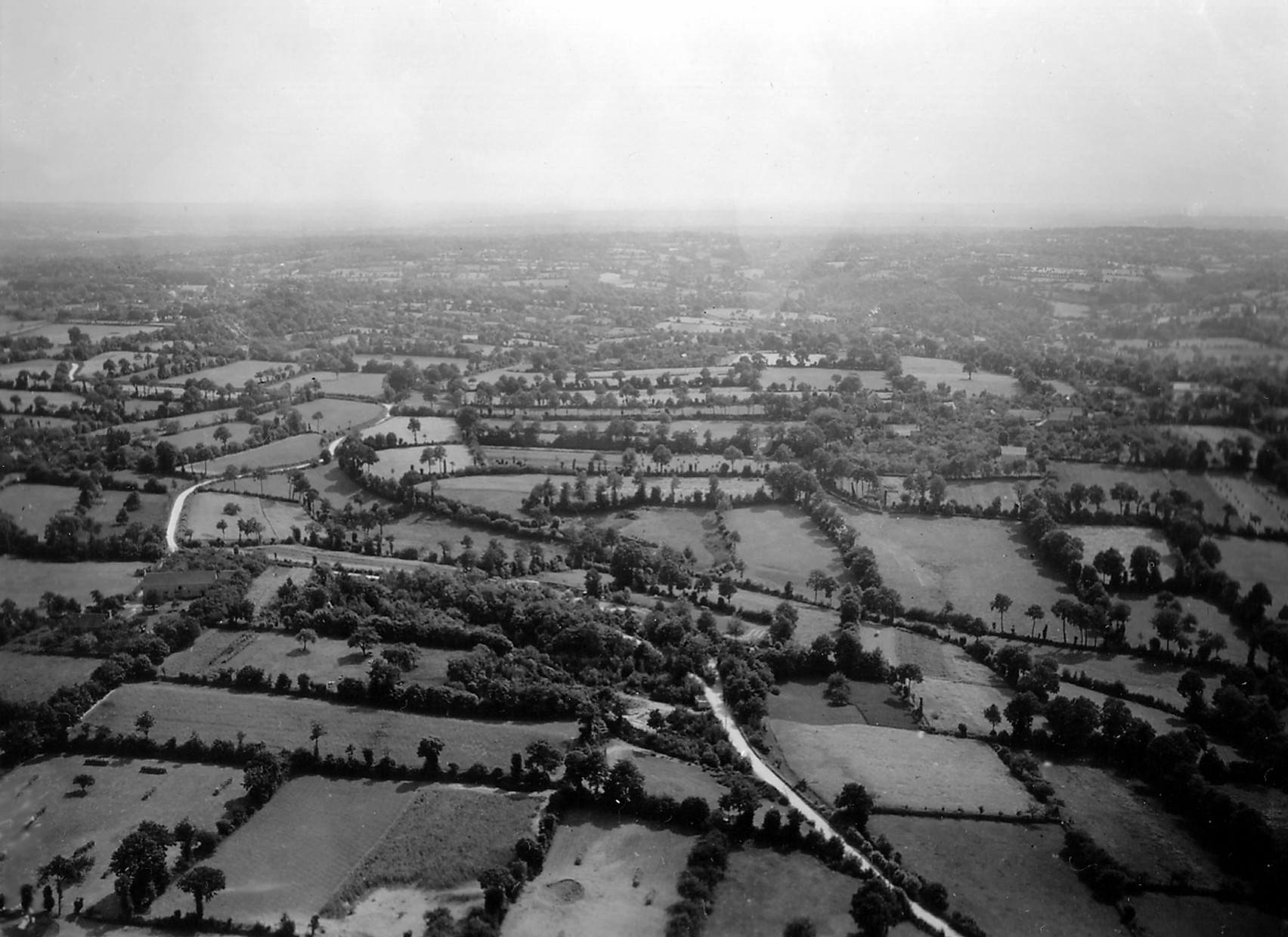
Hedgerows in Normandy as seen in an oblique aerial reconnaissance photo taken by the US Army Air Force before the invasion. In this photo the hedgerows present obvious obstacles to movement so why didn’t they get more serious analysis?


The German Army was the master of the defensive operation. We had already seen that in Italy, where German Field Marshall Albert Kesselring established a defensive line in the mountains north of Rome (known as the Gustav Line) that turned Churchill’s ‘soft underbelly’ operation into a meatgrinder that chewed up entire Allied divisions. In Normandy the local German commanders had months to study the problem and turned the hedgerow complexes into deathtraps. Every hedgerow corner, every road and trail, every chokepoint was covered by machinegun, mortar, anti-tank and artillery fire. Normandy was a defender’s paradise, and the Germans made the most of what they had. Normandy became a textbook case of a tactical defense in-depth, and the German efforts are still studied today.

U_S_Army_in_World_War_II_Photograph_of_GIs_Moving_Cautiously_Between_Hedgerows_in_Normandy

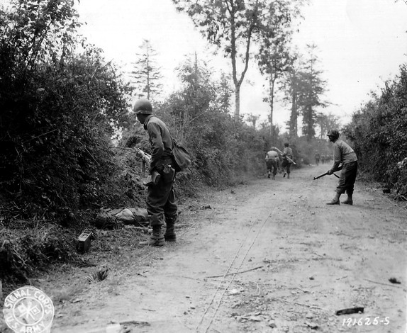
American Soldiers cautiously working along the hedgerows in Normandy to flush out German defenders


440615 hedgerows 2

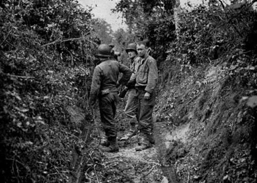
 American Soldiers standing in a narrow lane between two hedgerows somewhere in Normandy. This type of terrain became an alleyway of death for Allied Soldiers who only had two options – advance directly into the enemy fire or retreat back from it. There was no going around


The Allied armies never really defeated the hedgerow problem. The advance through Normandy became a slow slog with infantrymen fighting for every foot of terrain. The US Army eventually developed a set of combined arms tactics using dismounted infantry and tanks that allowed effective movement, but in the end it was commanders like General Patton who simply decided to punch through the hedgerow country and break out into the more open terrain south of Paris. In the end the Allies simply bypassed the German defenders in the hedgerows and left them to wither on the vine. Most surrendered within a few weeks, out of food, out of ammunition and out of the will to continue the fight.

But the question remains – how did we miss the impact the hedgerows would have on our tactical operations? We didn’t lack for topographic intelligence analysis during the planning phases for Overlord. The beaches and inland areas of Normandy received some of the most intensive Engineer terrain and intelligence analysis ever applied to a piece of ground. We collected tens of thousands of aerial photos (many of them in stereo), built hundreds of terrain models and printed thousands of special maps and geographic (terrain) studies of the Normandy region. Small unit commanders had the best picture of their objectives, and the terrain leading up to their objectives, than had ever been developed for any military operation up to that time – and yet we missed the hedgerows!

There’s no definitive answer in the historical record as to why the Normandy hedgerows were not identified as significant obstacles, but I can make a few good educated guesses as to what happened.

First, there is this intriguing passage from Chapter 13, Looking Ahead To The Continent from the volume ‘The Corps of Engineers: The War Against Germany’, part of the US Army’s official history of WWII (the excellent ‘Green Book’ series):

Hedgerow Statement

The large scale topographic map is the standard military planning document. Planners at all levels – from Infantry platoon all the way up to Theater Army G-3 – rely on the topographic map to provide an accurate representation of the ground they are going to fight over. The general assumption is that if it’s not on the map it is either not there on the ground, or it’s not important enough to worry about from a military operations perspective. Yes, the map is just a base to build on, but Soldiers are trained from day one to trust what they see on the map to be an accurate representation of what they will find on the ground. If hedgerows are missing from the map, even though they may be visible in aerial photography, the assumption is that someone further up the chain with more smarts and access to better data took a hard look at the hedgerow problem and decided it wasn’t anything to worry about. This seems to have generated a false sense of security regarding the hedgerow issue that permeated all levels of Allied command.

Additionally, in the same chapter Major General Cecil Moore, the Chief Engineer of the European Theater of Operations, admitted that his Engineer staff was inadequate to the task of providing all the topographic intelligence needed to support the invasion planning. Topographic intelligence was new ground to many Engineer officers and they lacked the education, training and experience necessary to provide the support needed. This is a remarkable admission considering all the other excellent Engineer analysis that took place prior to the invasion. My guess is that Moore’s staff focused tightly on analysis of the invasion beaches, exits from the beaches and the avenues of approach to the initial objectives, and German obstacle emplacements that were visible in aerial photos. There were river crossing operations, road repairs and improvements, airfield construction, port repairs and a whole host of other critical Engineer tasks to focus on. Hedgerows, if anyone on Moore’s staff thought about them at all, were probably considered a minor issue in the overall scheme of things.

There are three other issues that I’m sure probably came into play – wishful thinking, complacency and ‘go fever’.

Wishful thinking. Having served on Army planning staffs from brigade all the way up to theater army level I can assure you that there’s a lot of wishful thinking that goes on during the staff planning process. While we train our planners to not allow wishful thinking to creep into the planning process, many times tough problems that are just ‘wished away’ on the assumption that someone else will solve it or it will resolve itself before the operation gets underway. I’ve seen this dozens of times, like when I told a tank battalion commander that his 12 foot wide Abrams tanks won’t fit down that 10 foot wide trail in North Korea that he was planning to use. He waved his hand dismissively and told me that if and when the time comes he’d find a way around the problem.

Complacency. American Soldiers had been training in England for months before the invasion, and hedgerows are a common feature of the English countryside. But the hedgerows of England are were far smaller and easier to move through or over. Most could be simply hopped over. I’m sure many unit commanders looked at the aerial photos of Normandy and based on their experiences in England didn’t think the Normandy hedgerows would be much different. After all, a hedgerow is a hedgerow, right?

‘Go fever’ is the feeling that nothing is going to be allowed to stop the show. I’m sure ‘go fever’ saturated the Allied planning staff as June 6th approached. Nobody was going to try to halt the invasion for any reason; it was going to go as scheduled regardless of any last minute issues that might pop up. When an entire Army has ‘go fever’ nothing seemingly as minor as hedgerows will stop the largest invasion in history.

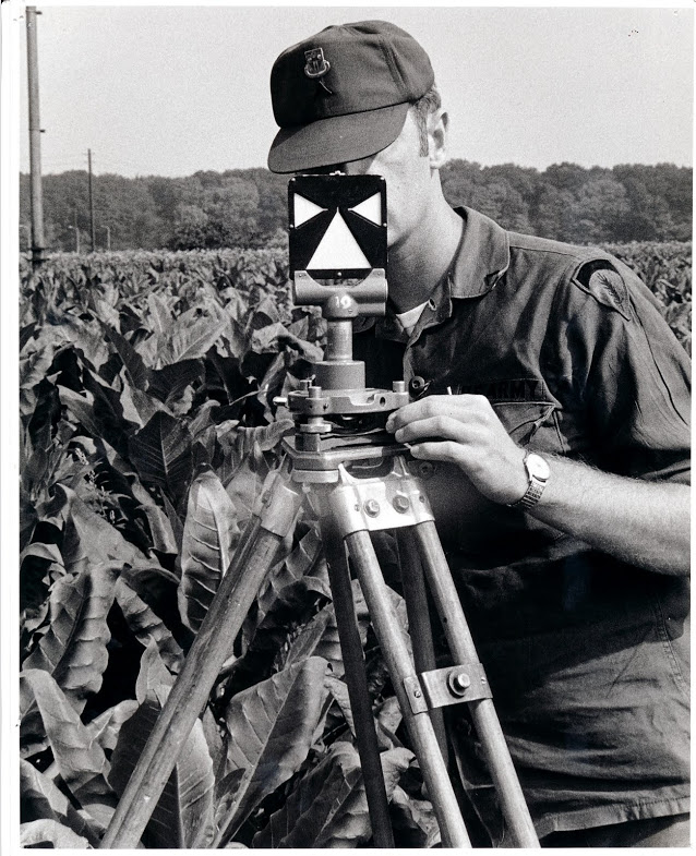
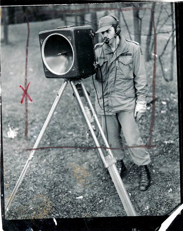
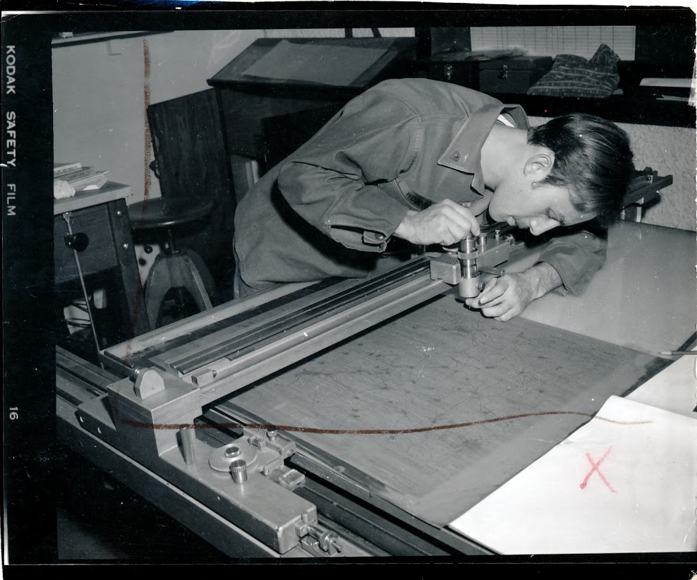
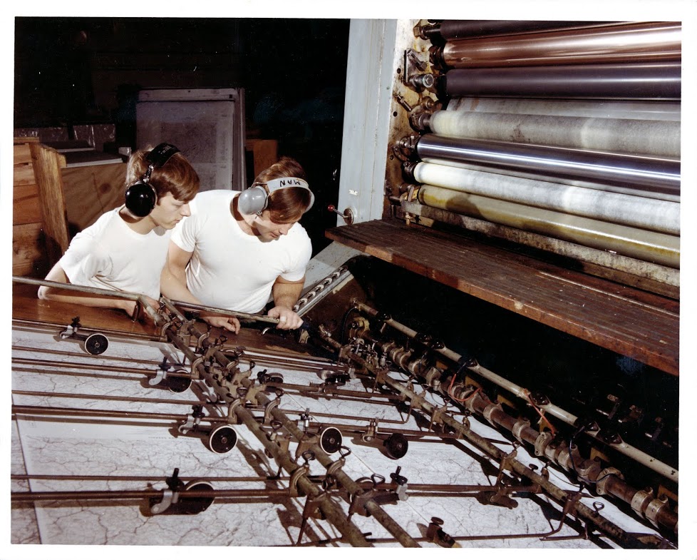
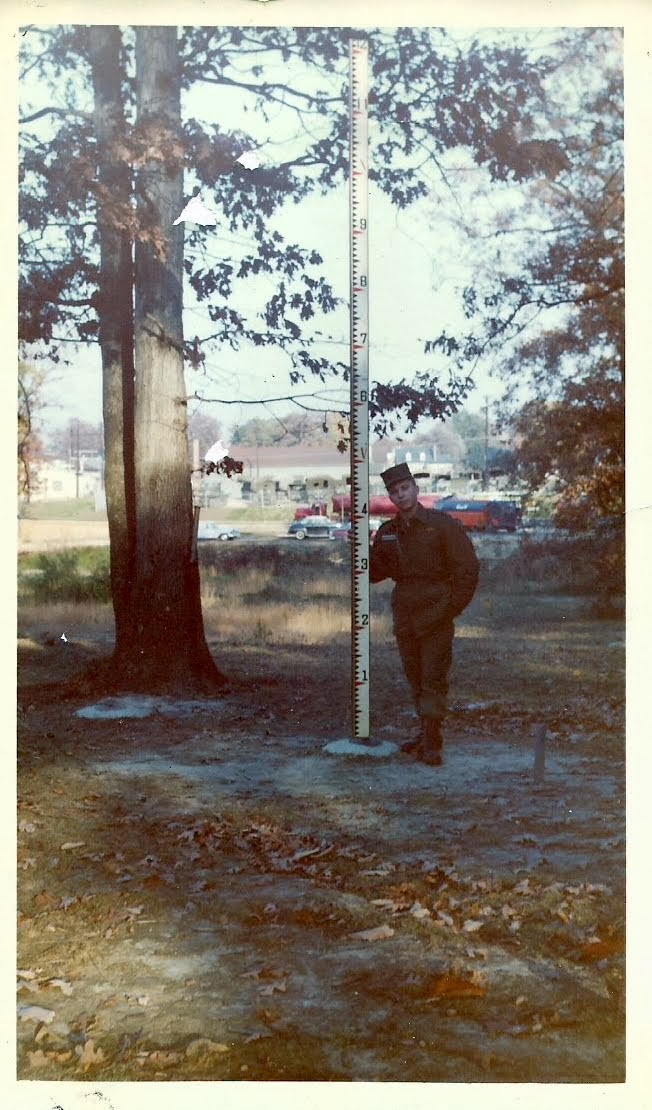
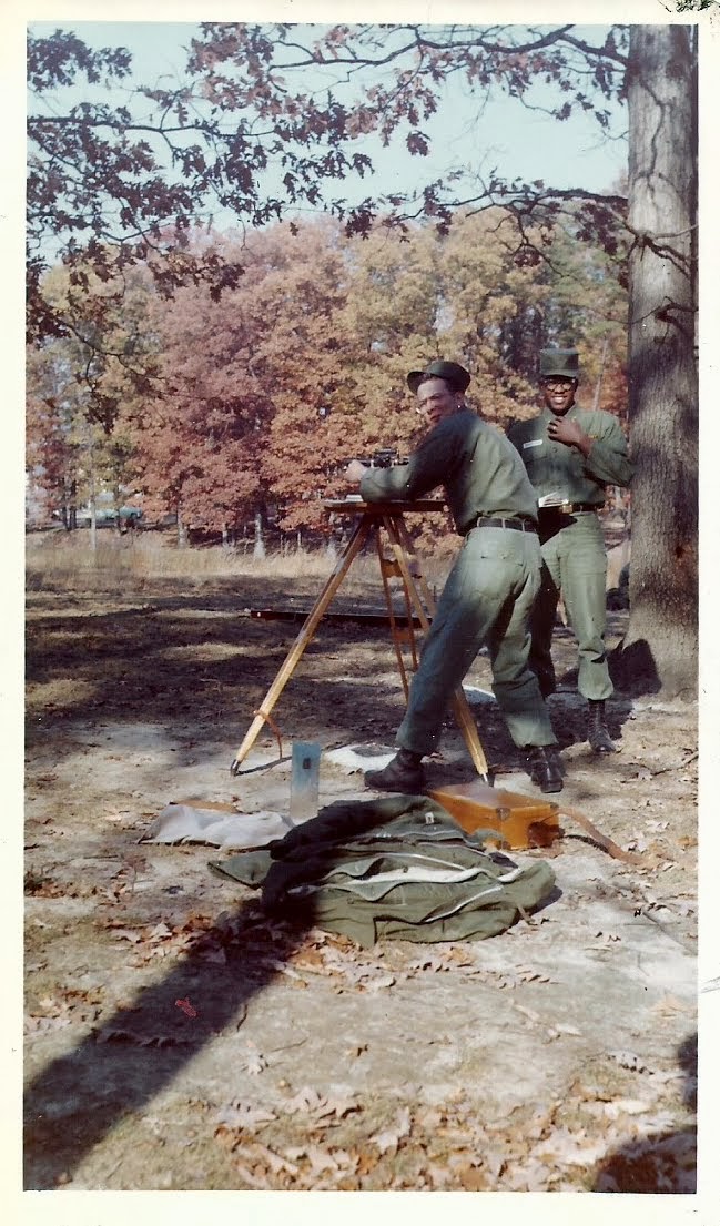
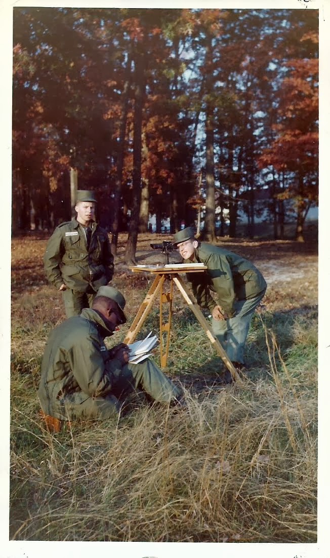
It took decades for the Army Corps of Engineers to recognize that topographic intelligence analysis was a critical skill that needed formalized processes and uniquely trained Soldiers. It was actually the Army Intelligence community’s efforts in the late 1970’s to formalize the Intelligence Preparation of the Battlefield (IPB) process that spurred the Engineers to action. IPB as an analysis process is heavily dependent on weather and topographic (terrain) analysis. The Intelligence community was set to establish their own organic terrain analysis assets when the Director of the Army’s Engineer Topographic Laboratory warned the Chief of Engineers that if he didn’t get serious about Engineers doing topographic analysis a key and historic Engineer responsibility would be ceded to the Intelligence field. Soon after the Corps of Engineers established the Terrain Analysis field and seeded Terrain Analysis units across the Army division, corps and theater army force structure.

Today Terrain Analysis is known as Geospatial Analysis and it’s the last vestige of the old Army topographic field left in the Army’s force structure. Since 1980 the Army’s Terrain/Geospatial Analysts have been doing the type of detailed analysis that might just have identified the hedgerows in Normandy as a serious obstacle. Our analyst are trained specifically to look at the small stuff – the trails, the fencelines, the stands of trees, even the hedgerows that might pose a problem for even the smallest of military units.

On this Memorial Day I’m praying we never have another ‘hedgerow problem’ on any battlefield American Soldiers are deployed to.

– Brian


Topographic Instructions of the US Geological Survey

How do you make a map? More precisely, how does one produce a map compiled to specific standards for accuracy, content and style? Does that question keep you up at night? Nah, me either. But it is an interesting question and I’d bet that if you put it to 100 people you’d get 110 answers.

Of course today it’s easy. Nobody really makes a map these days. Most just go to Google Maps on their smartphone or tablet, and these days that’s about all the ‘map’ most people want or need.

But 100 years ago things were much different. Back then there were still vast unmapped areas of the US and it was the responsibility of the US Geological Survey (USGS) to send topographic parties in to map them. This was before the era of cell phones, internet, GPS and even radio communications. Checking with the home office involved the US Mail or, if they were lucky, telegraph. For that reason these parties operated autonomously under the direction of a Party Chief. The Party Chief was part military general, part football coach and part college professor; he ruled with an iron fist and made sure everything was run properly, was responsible for the motivation and morale of his party and was the brains of the outfit. The Party Chief was vested with enormous authority because he had an enormous responsibility – he answered to his regional Chief Geographer for the accuracy and quality of his party’s work.

In 1913 Party Chiefs didn’t go about their work blind. They operated under a very detailed set of instructions and standards laid out in a USGS publication titled Topographic Instructions of the United States Geological Survey.

Topographic Instructions of the USGS

I find this a fascinating manual because it is the only publication I’ve seen that lays out in detail the steps necessary to create a map from scratch. It covers all the processes involved in creating a map to very specific accuracy, content and composition standards. This is, quite literally, the document that defined what we know today as the standard USGS topo quad sheet. Of course the USGS was producing standard topo sheets before this manual was published, but indications are that prior to 1912 the instructions were covered in separate publications and broken out by discipline. This manual brought it all together in a single reference that is remarkably clear and concise for its time, stripped of a lot of the superfluous language that Edwardian-era government functionaries were so fond of using. This is a manual designed to be used in the field by men who have a job to do.

The topics covered include

  • primary and secondary triangulation
  • primary and precise leveling
  • plane table surveying
  • map construction (compilation), drafting and editing
  • instrument care and repair

But beyond the technical, Topographic Instructions of the United States Geological Survey covers detailed administrative instructions to Party Chiefs on topics like crew selection, first aid for pack animals and crew members, how much food to pack, how many fountain pens to bring along, how to set up a base camp, even how to interact with local officials and the press.

It’s a soup-to-nuts manual on how to make a map from scratch.

– Brian

Map Makers At Work

I was going through some photos in my collection for some Facebook friends and ran across a collection of old shots I acquired while assigned to the 320th Engineer Company (Topographic) back in the late 1990s. I say ‘acquired’ because I just happened to find them lying around my office as part of some left over historical records from the old 649th Engineer Battalion (Topographic). All are 1970’s vintage photos that highlight the map making activities of the 649th. The 649th provided comprehensive topographic support – survey, map production & distribution, terrain analysis, and geographic intelligence analysis – to US Army Europe (USAREUR).

In the early 1980’s I was assigned to the 649th at Tompkins Barracks in Schwetizingen, Germany. I served as the commander of one of the terrain analysis detachments. I have a lot of good (and some not-so-good) memories of the 649th and the Soldiers that served in the unit. Fifteen years later I found myself back in Germany. By then the 649th had been deactivated and my unit, the 320th Engineer Company (Topographic), was the last surviving remnant of the 649th. The 320th had received a lot of left over equipment and paperwork from the 649th and one of my duties was to sort through it all to determine what was worth keeping and what could be trashed. During this process I found the photos you see in this post.

All of these photos were rejects, shots the photo editor didn’t think were worthy of using in a presentation. That accounts for a lot of the grease pencil ‘mark outs’ you see on many of the images. The interesting part is that the pictures that made it past the editor and into various publications or presentations are long gone – either packed up with the unit’s archives and locked away in an Army records warehouse or tossed into a trash can. Only the rejects survived to make it to my desk long after the battalion inactivated.

The 649th rarely made a new map from scratch. Most of the work involved updating existing maps or creating specialized overlays (like military operational graphics) to be overprinted onto existing maps. Still, the battalion had all the functional components necessary to create a new map:

  • Topographic and geodetic survey
  • Photomapping and cartography
  • Layout, photolithography and printing press operations

To accomplish these tasks each topographic company within the 649th was divided into three platoons – the Survey Platoon (topographic & geodetic survey), the Photomapping Platoon (photo control, compilation and drafting) and the Reproduction Platoon (layout, photolithography and press).

So let’s take a look at these processes as practiced by Soldiers of the 649th. This isn’t intended to be a comprehensive overview of map making; there are some large gaps in this tale simply because I don’t have any photos depicting specific steps. The real goal here is to highlight the Soldiers and their activities.


 Survey

Each map starts with two things – stereo aerial photography and a topographic survey to ‘tie’ the photos to their location on the face of the earth. Army topographic units relied on US Air Force photomapping squadrons to provide the aerial photography. Once the topographic unit got the aerial photography in hand it was up to the surveyors to go out and collect precise location data for points visible in the photographs – things like road intersections, prominent terrain features or pre-positioned survey point targets.

APPS

APPS – the Analytical Photogrammetric Positioning System. The APPS permitted surveyors and terrain analysts to precisely determine points on the ground using georeferenced stereo images. The system consisted of a point positioning stereoscope hooked to an early HP desktop computer. Each set of stereo images came with a computer tape that held the ephemeris data for each image. The operator would pick a point on the image in stereo (road intersection, building roof, etc.), tap a foot switch and the computer would print out the point location in latitude and longitude. The APPS was often used by surveyors to collect photo control point coordinates without having to do a formal field survey. For its time this was a revolutionary system.


Survey1

Surveyors ‘turning angles’ with a conventional theodolite (probably a Wild T2). The instrument would be set up over a known control point and used to measure the precise angle to other control points. The operator would call out the angle readings and the Soldier standing behind with the notebook would record the readings and do quick checks of the angle measurements to ensure the readings were accurate.


Survey4

What are the surveyors in the previous photo aiming at? One of these, of course! This is a Wild survey target. It would get set up over a control point that is key to the survey. The theodolite operator adjusts the crosshairs in the theodolite telescope so they bisect the white ‘arms’ and ‘skirt’, of the target, then reads the angle of measurement.


Survey2

 If a theodolite measures angles how do we measure distances? Well in the 1970’s we used microwave distance measuring equipment called the Tellurometer. The system consisted of a master and a remote unit and measured the time it takes a reflected microwave signal to return the master unit, which was then converted into distance. While I don’t have any hands-on experience using these units, I do remember sitting in on several meetings at the 649th where the surveyors discussed what a headache they were to operate and maintain. By 1980’s standards this was old technology and the units the Army had adopted were becoming maintenance nightmares. But in their time these distance measuring units were a revolutionary time saver. Note the headset the soldier is using. He’s actually talking to the operator at the remote unit via a built-in radio link. The two operators had to continuously coordinate settings and monitor performance during the distance measurement operation.


Survey3

 Here is the back of the Tellurometer unit showing the instrument settings panel.


Calculator

This picture shows the only Soldier in this series that I’ve met. CW2 Thomas (on the right) is demonstrating a new Hewlett-Packard calculator to a visiting British Army officer. CW2 Thomas was one of several survey warrant officers assigned to the 649th. We met at Fort Bragg, North Carolina years after this photo was taken. The Hewlett-Packard (HP) calculator is interesting because they were widely adopted by surveyors due to their rugged construction and advanced functions that were well suited to surveying applications. While I don’t think any HP pocket calculator was ever officially adopted by the Army they were in wide use at the Defense Mapping School where our surveyors were trained. Many of the HP calculators found their way into survey units through local purchase by individual units.


 Photomapping

Photomapping is the process of compiling a topographic map based on information seen in the aerial photographs. Military topographic maps consisted of at least five distinct information layers, each with its own color – cultural features (black), water (blue), vegetation (green), contour lines (brown) and boundaries and built-up areas (red). It is the job of the cartographer to extract each of these information layers from the aerial photography to create a map manuscript. First the cartographers would rectify each aerial photo by removing any tip or tilt in the photo and tying it to the survey control points. Then they would use a device called a multiplex plotter to project the photos in 3D so the cartographer can trace out the key features while viewing the photos in stereo. Once the information is traced onto a manuscript sheet it is passed over to other cartographers who precisely trace out the collected information using the precise symbols we see on the finished map.

Carto3

This photo shows a cartographer setting up a multiplex plotter in preparation for tracing out a new map information layer using photomapping techniques. The multiplex plotter used a stereo pair of aerial photos to project a 3-dimensional image of the terrain onto the white disc or platen of the mutiplex tracing ‘table’ (the device with the white disc seen sitting on the table). The tracing table has a small tracing dot engraved on it that sits directly above a pen holder. The stereo images have been transferred to two small glass diapositive images, and in this picture you see the cartographer holding one of the diapositives in his left hand as he mounts it into the projection stage. The tall ‘can’ in his right hand is the projector assembly that contains the projection lamp, lens assembly and filter. One diapositive is filtered red, the other blue, and the operator wears a pair of glasses with one red and one blue lens (just like the old-time 3D movie glasses), enabling him to see the projected image in stereo.


multiplex plotter

Here we see a cartographer tracing data from the projected image onto a manuscript sheet (usually a sheet of dimensionally stable material like Mylar). You can see entire image projected onto the the table surface just under his forearm, but only the small area projected onto the multiplex table platen is in focus. Engraved on the center of the platen is a small tracing ‘dot’, and mounted directly below it is a tracing pencil. The cartographer carefully adjusts the platen up or down so the tracing dot appears to rest directly on the ground on the stereo image and he then begins to trace out features. He traces one layer type onto each sheet; one sheet for cultural features, one sheet for hydrology (water), one sheet for vegetation etc.


Cartographer

Once a manuscript map layer is drawn it is turned over to other cartographers who carefully trace out the data using approved map symbols and line types. This is called the compilation process, where the cartographers compile the data into standard formats. Map compilation is precise and exacting work, and a cartographer can spend days, sometimes weeks, working on a single sheet.


Carto2

Once each manuscript layer is complete it the information it holds is photographically ‘burned’ or transferred to specially coated plastic called either scribe coat or peel coat (seen above). The words ‘scribe’ and ‘peel’ describe the manner in which the orange coating (seen above) is removed to create clear windows through which a photographic negative can be exposed. Because of the unique nature of the orange coating it completely blocks all the light wavelengths that a film negative is sensitive to, so the orange areas come out black (or unexposed) when the negative is processed. Cartographers use specially designed scribing tools to carefully etch away the areas that represent point or linear features like individual buildings or roads. For larger areas like lakes or farm fields a sheet of peel coat is used, which allows large areas to be carefully cut with a sharp knife or razor blade and peeled away.


Carto4

All military maps have grids, and the grid on each map is unique based on the area of the world it covers. Calculating and drawing these grids requires great precision and accuracy since the grids must be exact or the grid coordinates a Soldier derives from an improperly gridded map could be hundreds or thousands of meters off. Here a cartographer is setting up an automated plotting device used to precisely draw the grid for a particular map sheet. Automated tools like this greatly reduced the human error often encountered when drawing grids and speeded up map compilation.


Map Reproduction

Once the cartographers completed the map compilation phase the manuscript sheets were turned over to the Reproduction Platoon for all the steps necessary to print the final map. This normally involved preparing negatives from the scribe and peel coat layers prepared by the Photomapping Platoon, editing and correcting the negatives, making press plates and finally, printing the map.

Layout3

To speed up the map compilation process cartographers made heavy use of pre-printed text. Things like standard place names (cities, towns, etc.), major feature names (rivers, mountains, etc.) and road identification symbols (highways, autobahns, etc.) would all be identified using standarized text that was prepared by the Reproduction Platoon. The cartographer would submit a list of feature names with text style and size requirements and the Reproduction Platoon personnel would provide the information on clear adhesive backed sheets that were created using a photo transfer process. Here we see a Soldier setting up some text as requested on the order sheet attached to the clipboard.


Layout1

One of the last steps in map production is making the negatives from which the press plates are produced. Here we see a Soldier from the Reproduction Platoon doing a final check of a negative before approving it for plate production.


Layout2

The final step before going to press is the plate making or ‘burning’. Press plates are just thin sheets of aluminum specifically sized to fit on a printing press. A map layer negative representing all features of the same color (black, blue, green, brown or red) is placed on top of a press plate that has been coated with a photo sensitive emulsion and the two are placed in a vacuum frame plate maker that uses a high intensity lamp to ‘burn’ or expose the positive image onto the plate. Once the plate is burned it is washed to remove the emulsion and the resulting image is what gets printed on the map. In this photo we see a Soldier from the Reproduction Platoon doing a final cleaning of a press plate before sending it on to the press section.


Press3

The 649th ran a number of presses of different size and capacity, everything from small trailer mounted presses capable of producing only 1:50,000 and 1:250,000 scale maps to large format presses permanently installed in the battalion’s base plant and capable of producing over-sized maps and other geographic products. In this picture we see a press operator from the Reproduction Platoon loading a press plate onto a van mounted Harris offset press.


Press2

Here’s a photo of one of the 649th’s presses installed in its baseplant at Tompkins Barracks in Schwetzingen.


Press1

Here’s a photo of the feeder end of another one of the 649th’s large format presses. In this photo it looks like already printed map sheets are being fed back through the press to add another information layer or military overprint.


Map Distro

The very last step in map production is actually map distribution. The 649th also had a Map Distribution Platoon that stocked and distributed the printed maps to units all across Europe. The platoon was responsible for getting the most current maps into the hands of the front line soldier as quickly as possible. The 649th maintained a map distribution warehouse at Tompkins Barracks and at several contingency sites around Europe. The platoon even had specially designed vans that were mobile distribution warehouses that could service forward deployed headquarters. Here we see Soldiers from the Map Distribution Platoon restocking maps at the distribution warehouse at Tompkins Barracks.


And there you have it, Army field map production circa 1970. As I mentioned in the start of this post I’ve taken a lot of liberties by overly simplifying the map making process with the intent of highlighting the Soldiers and activities of the 649th. If any readers recognize any of the Soldiers shown in these photos (or if you happen to be one of these Soldiers) I’d love to hear from you. You can either add a comment to this post or contact me at oldtopographer(at)gmail.com. If I’ve made any factual errors in the map making process, or if I’ve mis-identified any of the process shown in these photos please leave a comment here and I’ll make the necessary corrections. Thanks, and I hope you’ve enjoyed this trip down memory lane!

– Brian

A Little Plane Table Work

A week ago I picked up some old photographs that are claimed to be of Army surveyors doing some plane table survey work on Fort Belvoir, Virginia.

The notations on the back of each photo gives each Soldier’s name and the date – November 1959.  While the location is supposed to be Fort Belvoir there’s no written indication that is the actual location. However, having been assigned to Fort Belvoir a number of times I’ll say that the vegetation certainly has that ‘northern Virginia in the fall’ look about it, so I’ll accept the fact that we are looking at a location on or near Fort Belvoir.

Another clue is the Soldiers, and more specifically their uniforms.  There’s no sleeve rank on any of their field jackets or shirts, indicating to me they are trainees attending advanced individual training at either the Engineer School or the Army Map Service school on Fort Belvoir.  These are most likely young men – probably draftees – who are learning the trade of surveying after graduating from Army basic training.  They simply haven’t been in the Army long enough to earn rank beyond that of Private.

Plane table surveying was once the primary method of developing detailed sketches and surveys of small areas.  The geodetic and topographic surveys would establish he broad framework of survey control and elevation for large areas or regions.  The plane table surveyors would follow behind filling in the details – roads, buildings, fence lines, monuments, prominent topology and geology, etc.  Plane table work was a close meld of surveying and cartography, and plane table sketches done by talented surveyors are true works of art.

Alas, plane table surveying is also a lost art.  It died off back in the 1980s with the introduction of electronic surveying systems – total stations – that can collect data much faster and much more accurately than a surveyor standing at a plane table.  While the output of a total station lacks any sense of artistic composition, the data tends to be more accurate and precise.

But back to our young men.  They had to have scored fairly high on their Army entrance tests to qualify for training as a surveyor, so this was a smart group of guys.  Odds are they all had very good math skills.

My guess is these young fellows all did their two year military obligations, left the service and went on to enjoy life in the civilian world.  A few probably went to college using the generous VA education benefits still in place in the 1950s, a few probably moved on to employment in blue collar jobs.  Odds are none of them stuck with surveying in the civilian world – that’s just the way things went.  However, I’m hoping that their exposure to surveying and mapping enticed at least one of them to pursue a civil engineering-related field once they left the service.

So let’s introduce our hale and hearty young surveyors!

Jim Heichel
Gustafson (no first name given)
McNeely & Robinson (again, no first names)
Robinson (sitting, recording), Gustafson (left)
and McNeeley (right)

These fine fellows are all in their 70s now and hopefully are looking back on long, successful and happy lives. I hope they view their time in the Army with great fondness and the memories of the this beautiful fall day spent in the field learning plane table work brings a smile to their faces.

Brian

The Harriman Geographic Index System

A few months back I picked up a packet of US Army training regulations and manuals that were published in the 1920s and deal with mapping and aerial photography.  Army publications from this era don’t often appear on eBay, and those dealing specifically with mapping, surveying and related topographic sciences are even rarer.  In fact, after years of hunting on eBay for historical publications dealing with these topics this was the first time I’d ever seen any from the inter-war period.  My guess is that virtually all outdated documents got heaved into the garbage can in the late 1930s as the Army was ramping up for war and new publications covering map production and map reading were introduced.

I was surprised to find myself in a small bidding war for these documents.  I’m sure it wasn’t against anyone with a specific interest in Army topographic history.  The other bidder(s) were more likely motivated by the relative rarity of the documents.  In the end I paid about $30 for the packet and at the time I thought I’d bid too high.  As it turns out I think I made a good investment.

The packet included five Army Corps of Engineers publications:

  • Training Regulation 190-7, Topography and Surveying, Map Reading – The Harriman Geographic Index System (July 15, 1927)
  • Training Regulation 190-25, Topography and Surveying, Topographic Drafting (June 21, 1923)
  • Training Regulation 190-27, Topography and Surveying, Aerial Photographic Mapping (January 23, 1925)
  • Training Manual 2180-35, Topography and Surveying, Special Methods of Relief Representation (January 3, 1928)
  • Training Manual 2180-45, Topography and Surveying, Meridian Determination (April 16, 1928)

As a group these manuals represent an interesting view into the evolution of Army mapping activities that incorporate the lessons learned and the new technologies that emerged from our experience in WWI, particularly the use of aerial photographs as map substitutes and as base data for topographic map compilation.  In these documents you get the sense that the Corps of Engineers is starting to realize that it now has significant responsibility for providing standard map products to a modern Army with a potential world-wide mission.

Most of these publications cover topics I’m well familiar with, but the Harriman Geographic Index System is something I’d never heard of before.

Click on the photo to enlarge

Once I read through the document I realized that the Harriman system is designed to allow a Soldier to accurately locate himself or any feature on a map to within a few hundred feet anywhere in the world.  In essence it is an early worldwide grid reference system (although it bears no resemblance to the current Military Grid Reference System).

It is also very complex.  While the mechanics of the system were fairly easy for me to figure out, I can’t imagine myself standing in front of a classroom of Soldiers trying to teach this system.  It might have been a useful tool for well educated officers working in the relative comfort and calm of a rear-area command post, but for a tired, cold and scared draftee with a 9th grade education who is sitting in a muddy foxhole trying to call for artillery fire support this system is all but unusable.

The Harriman system uses the South Pole as the origin point and the International Date Line as the meridian.  It successively divides up the Earth into smaller and smaller rectangles based on latitude and longitude.  Each of these rectangles get an index number in the Harriman unit system that, when combined, permit locating features to within about half an acre.

Harriman ‘units’

Since the Harriman system is based on latitude and longitude it is projected onto a spheroid.  This means the land areas defined in this system vary with latitude.  The further away from the equator the smaller the land area encompassed by a Harriman system rectangle.  This also means the Harriman system is not a point identification system like the Military Grid Reference System, but is an area reference system that defines smaller and smaller rectangles on the face of the earth.  The smallest area that can be defined in the Harriman System, the Position Unit, is 2 seconds in latitude and 1 second in longitude.  This equates to about a 4,875 sq. ft. ‘box’ at 49 degrees latitude, or about a 70 ft x 70 ft area on the ground.  The Harriman system has the potential to identify a point feature such as a road intersection with a positional accuracy that is well within the map accuracy standard for a 1:50,000 topographic line map.  From a practical perspective Harriman’s system is accurate enough.

Harriman Index Geograph

But it’s the identification of these units that can get confusing.  The Harriman system requires the user to concatenate an ever longer string of numbers, separated by colons, semicolons and slashes, to identify locations.  The smaller the area the longer and more confusing the string.  For example, according to the manual the Harriman system ID for Battery Byrne at West Point would be designated as 2665:4515; 7792. Users of the Military Grid Reference System (MGRS) could argue that this system can be just as confusing. However, I’d counter that the MGRS use of the grid zone designation (ex: 18T) and the 100,000 meter grid zone ID (ex: WL) alpanumeric system takes a lot of confusion out of sending and receiving coordinate locations.  For example, the MGRS coordinate identifier for the same Battery Byrne location is 18T WL 8726 8316.  Perhaps it’s my 30+ years of using MGRS that has me jaded, but I just think MGRS is less confusing.

Now the Harriman system isn’t a bad system.  In fact, it’s quite logical and it works well within its known limitations.  And I have to be honest, before the Harriman system there was… nothing.  The Chief of Engineers was quite clear about what the Harriman system is and is not:

“It should be realized that the Harriman index system is in no sense a method of map making or of chart building; still less is it a new system of projections.  It is merely a simplified system of using an established arrangement.  It may be used on any map or chart, regardless of projection or scale, provided the longitude and latitude of the southwest and northeast corners are available or can be determined by scaling on the map.  Since only arabic numerals are employed in location designation, this system is capable of use in any language.”

In the late 1920s the federal government seemed quite enamored with the system and there are indications that a number of federal agencies had adopted it.  In 1928 Congress actually held hearings to decide whether to purchase an unlimited use license from its developer, George C. Harriman. But other than a few tangential references on the web I can’t find any more discussion about it.  This training regulation is the only full reference I’ve found.  Even more interesting, when reviewing Army topographic references – training and field manuals – published beginning in the late 1930s as the US Army ramped up for war, I find no references to the Harriman system.

It appears Mr. Harriman’s system was a flash in the pan, dropped by the Army in the 1930’s as the Corps of Engineers realized it needed a better map coordinate system to address the exploding world-wide mapping requirements.  The Army needed a coordinate system that was logical, consistent, accurate and easy to teach to the millions of draftees about to be deployed to battlefields around the world.  It was out of this requirement that we got the Military Grid Reference System, a system stood the test of time and war.

Brian

Thinking in 3D

This week at work, just for fun, I set up a stereoscope and slid some stereo photos underneath the mirrors. These photos are high resolution, large scale shots taken back in April when we had a new orthorectified aerial image of the airport developed.  I asked the contractor to send me a stereo pair from the project that I could play around with.  It’s been years since I spent any time peering though the optics of a stereoscope and it was fun to look over the images and realize just how much a stereo view adds to one’s ability to pick out details.

There was a time when analyzing stereo images was a critical skill in my field and other related fields.  But with the rise of commercial satellite imagery, the slow demise of wet process aerial film cameras and the development of digital imagery analysis systems like ERDAS Imagine and ESRI’s improved raster management routines in ArcGIS there has been less and less call for hard copy stereo image analysis. Software routines now handle most analysis tasks.  Of course photogrammetrists still process, manage and analyze stereo imagery, but it’s all done on high end digital systems these days.  The fields that used to derive benefit from hard copy stereo imagery – topography, geology, forestry, hydrology, even the US military – all seem to have lost their institutional ‘feel’ for the usefulness of stereo imagery analysis.

The issue was brought home to me this week when I invited a small group of GIS professionals and Engineering staff (both licensed civil engineers and engineering technicians) to drop by my desk to have a look at these stereo photos.  Most could not get the photos properly aligned underneath the stereoscope. Few recognized any real benefit from seeing the structures in stereo.  Most thought it was just a cute parlor trick. That’s a shame because the stereo photos permitted quick and easy identification of features that are not readily apparent in the same 2D images.  Things like antenna masts and raised utility piping on the roofs of concourses, raised concrete pads and curbing in the aircraft gate areas and even small assemblies like receiver domes on the tops of aircraft fuselages stood out in clear detail when viewed in stereo.
.
So how does one use stereo photos for analysis?  Check out this blog posting from a while back.

Conducting stereo analysis using hard copy photos should be much cheaper and easier these days.  Years ago in the era of wet process film cameras making copies of stereo photos was time consuming and expensive. Someone had to pull a roll of film negatives, go into a darkroom and make prints one by one. With today’s digital imagery systems all one has to do is download the image files from a server and print them out using relatively cheap but very high quality color ink jet printers.  The images I received from our contractor were full resolution TIFF files, each about 1.4 gigabytes.  I was able to subset just the areas I wanted to view and print them out at full resolution using only the image management software that comes with Windows 8.  Fast and cheap!

Federal and state governments are sitting on a gold mine of historical stereo aerial photos.  The Federal government (USGS, USC&GS, Soil Conservation Service, Department of Agriculture, Tennessee Valley Authority, Army Corps of Engineers, etc.) started using stereo aerial photography for mapping as early as the mid-1920s and over the course of the next 90 years proceeded to photograph virtually all of the United States in stereo.  Stereo aerial photography was the foundation of all of our topographic mapping activities through most of the 20th century and it remains so today.  Much of this photography is still held in individual agency archives or has been turned over to the National Archives. I’d love to see the National Archives digitize and post nationally significant stereo pairs of images online for downloading and viewing. Places like the Grand Canyon, Yosemite and Yellowstone or historic events like the Mount St. Helens post-eruption photos or levee breaches along the Mississippi River during the spring floods.  Even historic shots of our cities and suburbs that will help students understand how topography impacts issues like urban sprawl.

Humans view and relate to their world in three dimensions.  It’s a shame that today we are relegated to investigating it via boring 2D computer displays.  I think it’s time to bring back 3D image analysis!

Hands Off Data Collecting With Huey, Dewey and Louie

A few weeks ago I posted a blog discussing how my organization is testing the newest release of ArcGIS for Windows Mobile 10.1.1.  I’ve started to use the combination of the ArcGIS mobile software and my Trimble Juno to collect walking trail data on a fairly regular basis.  I call it ‘development’.  My wife calls it ‘playing around.’

Anyway there are three occupants of my house that think my only job in life is to take them outside and entertain them.  They shall rename nameless, but they each have four legs and a tail.  Whenever they see me putting on a jacket or lacing up my boots or tossing things into a backpack they go nuts jumping around, barking and causing general mayhem.  “It’s walkie time!”

Now, I don’t mind having them along on a walk or hike.  They are generally well behaved.  Unless they see a cat.  Or a deer, squirrel, rabbit, duck, goose, bird, grasshopper, snail, ant or, heaven forbid, another dog.  Other than that they’re fine.  Great company.

But managing three dogs and a data collector is all but impossible unless you’re an octopus.  I was in a quandary; how do I take these three amigos along on a data collection hike and get everything done?  Well today I had one of those ‘duh’ moments, as in ‘duh, why didn’t I think of this before?’  Just launch the collection job on the Juno, toss it into the zippered compartment in the lid of the rucksack (where it sits up high and the internal GPS receiver should have a fairly good ‘view’ of the sky), hitch up the dogs and start walking!

Launch the data collection job on the Juno and go!

When I started today’s walk I wasn’t 100% sure how this would work out.  I’ve carried other GPS receivers in pockets on the shoulder straps of rucksacks before, but I wasn’t collecting data with those units.  As I walked the trail my mind was working, thinking up all sorts of configurations and contraptions I might use to improve signal reception.  By the end of the walk I had myself convinced that what I needed was some sort of pole mounted external antenna.  I had it all figured out in my mind – about 4′ of quarter inch PVC with a metal plate epoxied to one end and a magnetic patch antenna (which Trimble makes for the Juno) stuck to that, with the antenna cord running down the tubing and connecting to the Juno inside my rucksack.  I could lash the PVC tubing to the side of the pack using the compression straps.  Absolutely, perfectly Rube Goldberg-esque!  Why it was so clever I’d be the envy of all the neighborhood GPS data collecting kids!

Rides nice and high in the pack where signal reception is pretty good!

At the end of the hike I pulled the Juno out of the bag and realized I didn’t need all the fancy gadettry I was dreaming up.  The Juno did just fine collecting data while sitting snugly inside the rucksack lid.  It’s not a perfect setup by any means; the GPS signal still has to penetrate the bag material and my big fat noggin’ blocks a lot of the signals, and it’s impossible to stop collecting streaming GPS data to collect point data.  But for hikes like these where I’m just after trail alignments it works fine.  The Juno isn’t a survey-grade instrument anyway so some GPS track shift is to be expected, particularly under heavy tree canopy.

“Hey, we really like this data collection thing!”

So how did we do?  Not bad.  I need to clean the data up somewhat and I know that in the future if I’m set up for GPS data post processing I’ll get better accuracies, but for now it’ll work.  As was said in that classic movie about chronic over-achievement, “That’ll do pig.”


Busting Brush with ArcGIS for Windows Mobile

Huh?  What?

OK, at work we are testing a new software package – ArcGIS for Windows Mobile.  The name is a mashup of two software package names – ArcGIS (ESRI) and Windows Mobile (Microsoft).  Yes, it is a cumbersome name.  Really, really cumbersome.

It is nothing more than a lite version of ESRI’s ArcGIS software designed specifically to run on the Windows Mobile OS.  Never heard of Windows Mobile?  Don’t worry, you haven’t missed much.  It’s an operating system that saw its widest use on mobile phones.  Notice I didn’t say ‘smart’ phones, because Windows Mobile was (and still is) an awful operating system that made every piece of hardware it touched dumber.  Same for its users.  I’m sure when Steve Jobs was yelling at his software engineers during the early stages of Apple’s iOS development he forced them to use Windows Mobile phones so they clearly understood what  iOS would not end up looking like.

Microsoft has moved on and introduced their new Windows Phone OS that is based on the Windows 8 platform.  However, their Windows Mobile OS hangs on in a few interesting places.  It’s used a lot in ’embedded’ applications, computers running inside of other things that don’t look like computers.  For example, the Microsoft Sync system that controls just about everything in my new Ford F-150 is a version of Windows Mobile.

Another place Windows Mobile has achieved a lot of market penetration is in the surveying and GPS-based data collection market.  These are highly customized hardware systems that are more than mobile phones but less that full-fledged computers, robust devices dedicated to a narrow set of field data collection tasks.  Virtually all manufacturers of surveying and GPS-based field data collection systems use Windows Mobile – there’s really nothing else available today that meets the need.

Two of the devices in this picture run on Windows Mobile.
The rest are easy to use.

Because of this ESRI still develops a lot of software to run on the Windows Mobile OS (now up to version 6.5 and renamed Windows Embedded Handheld).  ArcPad, ESRI’s flagship field data collection package, has been running on the Windows Mobile platform for almost a decade.  A few years back ESRI released a version of its server software (called, naturally, ArcGIS for Server) that allowed the user to develop GIS applications that run on Windows Mobile handhelds and consume map services hosted on a local ArcGIS for Server instance.  We tested this at work but came away with the impression that the whole system required more care and feeding than we were able to provide.  In addition, our IT department was never willing to cooperate and provide a way to authenticate these mobile devices (Trimble Junos) on our organization’s domain so they could ‘see’ our internal GIS software servers.

Instead, we’ve spent the last year developing mobile GIS applications to run on Apple iOS devices – iPads and iPhones – and leveraging the new hosted map service concept available through ESRI’s ArcGIS Online cloud service.  The entire system works amazingly well and our users like the idea of collecting GIS data using an iPad (plus they can play Angry Birds in their down time).  But as we tested and developed in this environment we quickly bumped up against another roadblock – again, our IT department.  They repeatedly refuse to approve the purchase of iPads for the user base.  No real explanation – they say no just because they can.  We were stuck and desperate for an alternative.

This all changed in late February with the release of ArcGIS for Windows Mobile 10.1.1.  The #1 change with this new version is the ability of the software to connect to an ArcGIS Online subscription account and use a hosted (cloud) feature service as a data layer.  We no longer are forced to use our local instance of ArcGIS for Server as the data source.  Since the data is hosted in the cloud all we need is a wi-fi connection and an ArcGIS Online subscription account to get to our data.  The need to have our mobile devices authenticate on our organization’s network is gone.  Our dependency on our local IT department is severed.

The other big benefit that ArcGIS for Windows Mobile brings is the ability to do disconnected editing when there is no wi-fi signal available.  This was always a concern with the iOS devices, which require an ‘always on’ internet connection when being used to collect data.  ArcGIS for Windows Mobile works differently in that the application places a copy of the map layer’s database directly on the mobile device when it is first downloaded from ArcGIS Online.  In the field a wi-fi connection to the internet is not necessary – all the newly collected data and edits are stored on the mobile device.  When the user get back under wi-fi coverage they can do a synchronization of this new data with the master database stored in the cloud on ArcGIS Online.  The new data is pushed up to the master database via a wi-fi connection to the internet – any wi-fi connection to the internet; in the office, in Starbucks, in McDonalds, wherever they can get a signal.  Simple, slick and robust.

But why Trimble Junos?  While our IT department balks at the purchase of iPads, they have no problem with us purchasing Junos even though the current generation of Junos cost about twice as much as an iPad!.  IT views them as dedicated field survey devices and allows us to buy as many as our budget can support.  Over the past two years we’ve purchased seven of them so we have plenty of hardware available to put into the hands of our users.

The Trimble fairy barfed on my desk

So like any good Geospatial weenie I figured I needed to test my applications before unleashing them on the unsuspecting public.  To acquaint myself with the workflows embedded in ArcGIS for Windows Mobile I set up a project to collect data during one of my favorite activities – hiking.  Then it was time to take ArcGIS for Windows Mobile to the wilds of suburban Atlanta for the ultimate test: can a befuddled 56 year old make sense of this mobile thing and actually collect useful data?

Everything I need to survive – water, food, first aid kit and
ArcGIS for Windows Mobile on a Trimble Juno

So how did everything work?  Pretty darned good.  In fact, better than I expected.  The simplified workflows in the ArcGIS for Windows Mobile interface make collecting data almost foolproof.  I only had a chance to capture about two miles of trail information and some points of interest, but it was enough to convince me this mobile GIS interface will work just fine for most of our user base.  Of course it’s an imperfect world, and so is this application.  I’d love the ability to collect photos while remaining in the GPS data streaming mode, and being the GPS geek that I am I’d like a better GPS performance interface (similar to what you get with ArcPad or Trimble’s TerraSync), but I also understand this package is designed for simplified data collection by non-GIS personnel, so I can live with the lack of GPS performance data.

Yellow SO clashes with my woods gear!

Of course all this simplification also serves as a straightjacket.  What you give up with the ArcGIS for Windows Mobile interface is the ability to make on-the-fly changes to your project – add new data types, change symbology, adjust GPS performance parameters, do complex searches, buffers, etc.  It’s a trade-off;  reduced complexity =  fewer options.  It’s a trade-off my organization can live with.

ArcGIS for Windows Mobile up close and personal.
A simple interface that works well on devices with small screens.

The REAL elephant in the room is the overall cost of this capability.  ArcGIS for Windows Mobile is an enterprise level solution for enterprise level projects.  As configured this project relies on an ArcGIS Online subscription account as the data hosting platform and ArcGIS Mobile deployment licenses tied to a very expensive ArcGIS enterprise license.  This equates to about $55,000 in licensing costs (toss in another $1,200 or so for the Trimble Juno).

Obviously this is not for the little guy.  But it should be, and it can be!  Let’s say you are a Geospatial geek like me.  Right now, today, if you participate in the ArcGIS for Home Use Program you get one free user license for  ArcGIS for Windows Mobile.  The software package includes a toolset that allows you to stage all your data on your local computer instead of on ArcGIS for Server or in the ArcGIS Online cloud.  You don’t get to wirelessly update your data – you have to connect the device to your computer via USB to do the synchronization process – but the rest of the workflows are the same.  A great (and cheap) way to test this capability for yourself.  You just have to go find a compatible Windows Mobile device (check eBay, there’s plenty for sale out there).

Looking into the future I see ESRI opening the ArcGIS Online subscription program up to market segments that don’t need and can’t afford to buy into the service at the current enterprise-like levels.  It’s almost an inevitability.  There’s a lot of emerging competition in the cloud GIS services arena, and companies leveraging some of the better Open Source GIS tools will start to provide low cost cloud hosting services in direct competition with ESRI.  Of course ESRI has the market share and clout, but the ‘cloud’ is a huge space, there’s a huge potential market, and ESRI can’t control it all.  Price competition will soon have its inevitable impact.  Plus, ESRI is pushing ‘the cloud’ like it’s the Second Coming and at some point they will realize their service availability will have to mesh with their message.  As they move more and more capability to the cloud ESRI will have to start offering low cost services for the little guy.

Maybe not this year, maybe not next year, but soon.

In the meantime use what’s available and get moving on Mobile!

Brian

The Englshman Who Went Up a Hill

…and came down a mountain.

It’s cold and rainy outside, the Mrs. is taking a nap and the dogs are too. I went looking for something quiet to do and stumbled upon my old copy of the quaint English film ‘The Englishman Who Went Up a Hill But Came Down a Mountain’


There aren’t many movies made about map makers, surveyors or cartographers. Damned few. The tedious film ‘The English Patient’ usually comes to mind, although the map making connection is just a plot mechanism to explain why a Hungarian count with an impeccable English accent is poking around Egypt and North Africa. I don’t think a map is shown in the entire movie.

In the opening scenes of ‘Lawrence of Arabia’ we see Lieutenant T. E. Lawrence helping to color a map in a military office in Egypt. This is a pretty accurate snapshot of Lawrence’s activities before he was sent out to foment revolt among the Arab tribes. Before WWI Lawrence worked extensively as a field archaeologist in the Transjordan region and was a skilled map maker. During WWI he was initially employed in making military maps of the Middle East. Back then cartography and field survey were essential skills for explorers of all types and Lawrence was no exception.

There’s lots of other movies with oblique references to maps, mapping and surveying. The Indiana Jones series comes to mind, as does the 1999 movie ‘The Mummy’, but that’s about all I can t hink of right now.

So back to our movie. ‘The Englishman Who Went Up a Hill But Came Down a Mountain’ is the only film I can think of that revolves around surveying and cartography. The movie is loosely based on the true story of a group of Welsh villagers who, during World War I, conspire to have two British Ordnance Survey cartographers designate their local hill a true mountain so they can continue to lay claim to having “the first mountain in Wales.” At its heart the movie is the story of a village, devastated by the loss of its young men on the battlefields of France, that struggles to retain its dignity. There’s also a charming love story woven into the plot between one of the cartographers (Hugh Grant) and a local girl (Tara Fitzgerald). The film is stuffed full of colorful characters who are all in cahoots to keep the cartographers in town while they surreptitiously add 20 feet to the top of their hill so it meets the minimum elevation requirement to be called a mountain. Hence the somewhat long title.

The movie is a charming period piece. Whoever did the costuming did a great job. The scenes of the two cartographers working atop the mountain, kitted out in all sorts of period field gear are fun to freeze frame through (I particularly like Hugh Grant’s leather map case). The one glaring mistake the director made is having the crew use a dumpy level in the place of a surveyors theodolite to measure the angles between adjacent hills, but I’ll forgive that slight hiccup. Everything else looks spot-on, including the scene where Hugh Grant is doing some preliminary cartography work using an adjustable steel tipped pen and bottles of ink.

Here’s the scene where the locals get the word that their mountain is really a hill. Colm Meaney plays the local pub owner, town cad and ringleader of the whole effort, and is a hoot to watch:

The movie is slow and charming. A classic little English gem. It would be a great film without all the mapping and surveying stuff, but having it all in there makes it even better.

Highly recommended for rainy days.